Building the Foundation
Building the Foundation — Going from no shared design language to Canal DS: 1,000+ tokens and 150+ components powering Canal+ Polska's e-shop and customer-service products.
Type
Design System
Date
2023
Outcome
Driving consistency, speed and accessibility across every product

Problem -The Polish e-shop and customer-service products had no shared design language. Every team made independent decisions — inconsistent components, hardcoded values, and no single source of truth for designers or engineers.
Solution - Built Canal DS from zero: a three-tier token architecture, a four-layer component library, documentation and lifecycle governance, and embedded with engineering to make it real in production code — a system separate from the Groupe's shared system but coherent with it.
Outcome - 1,000+ tokens · 150+ components · the single source of truth for Canal+ Polska's e-shop and customer-service products, serving a subscriber base in the millions.
The Short Version
In 2023, Canal+ Polska had no design system of its own. Without a shared foundation, products like the e-shop (boutique) and the customer-service tools were hard to manage — every team made decisions independently. Components were duplicated, then duplicated again. Tokens didn’t exist. Designers and engineers worked from tribal knowledge rather than a shared system. I built Canal DS from zero — established the architecture, defined the tokens, built the component library, embedded with engineering to make it real in code, and remained its sole owner as it scaled. The system is dark-first (dark is the primary theme of the Canal+ brand) and fully tokenised (nothing references a raw hex or pixel — it references a token, all the way down). Three years later it’s the single source of truth for the products it covers.
Context
Canal+ designs at two levels. In 2025 the Groupe rolled out a shared design system — DIVE, built by the France team and used mainly for the French boutique and the player; the Polish team contributes components to it, and some general, foundational pieces look similar across both. But Poland’s own products — the e-shop and the customer-service tools — had needed a system tuned to them, on Polish timelines, since well before DIVE existed. That’s the system I built and own: Canal DS — started in 2023, two years ahead of the Groupe system, separate from DIVE, sharing the same instincts on the general components but free to specialise where the Polish products require it.
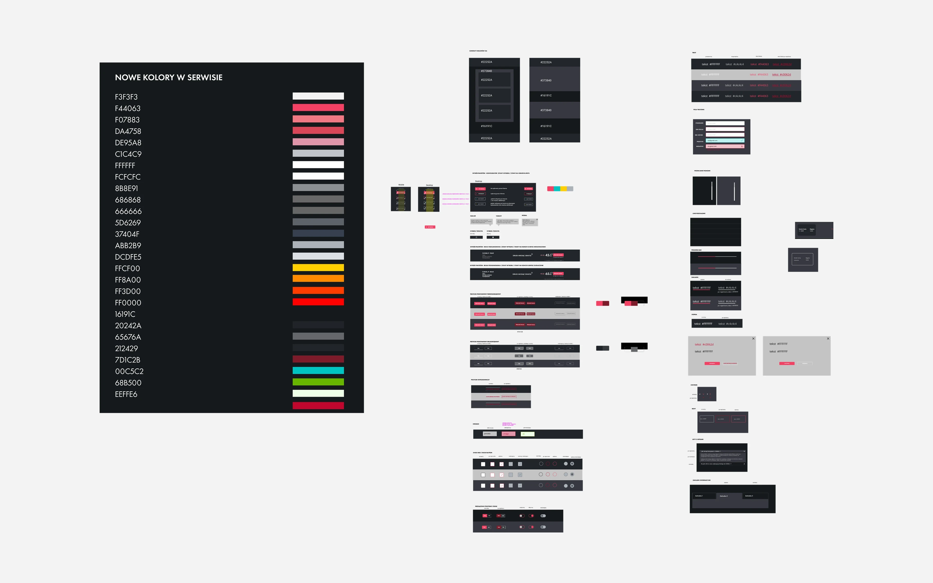
Inside those Polish products, the situation was predictable. Designers working on different screens made different micro-decisions. Buttons looked slightly different. Spacing was inconsistent. Typography scaled differently across breakpoints. There was no single place to look something up — there was just what had been done before, passed from designer to designer through Figma files and memory.
Engineering worked the same way. Without a token architecture, colour values were hardcoded. Without a component spec, developers built their own interpretations of designs. The gap between what was designed and what shipped was a constant source of friction.
The Problem
Inconsistency at scale isn’t just an aesthetic problem. It’s a velocity problem.
Every time a designer started a new feature, they spent time making decisions that had already been made — and sometimes made differently — somewhere else in the product. Every time an engineer built a new component, they built it from scratch rather than from a shared base. Every time a product change required a visual update, it had to be made in a dozen places instead of one.
The compounding cost of no system: it’s not that any individual decision was wrong. It’s that there were too many individual decisions. Without a shared foundation, the product was rebuilding itself continuously, and slowly pulling apart at the seams.
The business case was clear. What wasn’t clear — at the start — was where to begin.
Discovery & Audit
Before building anything, I needed to understand what already existed.
The visual audit. I catalogued the UI across the e-shop and customer-service surfaces: every component, every colour usage, every spacing unit, every type style in active use. The audit produced two things: a map of what existed, and a map of the contradictions — places where the same element was implemented differently without a documented reason. The clearest example surfaced later, in messaging: the product had roughly a dozen ways to say “something went wrong,” with three different reds for “error” and no agreement on any of them.
The engineering audit. Working with the development team, I mapped the current state of the codebase’s UI layer: where values were hardcoded, where components existed as one-offs versus shared utilities, where the most duplication lived. This conversation surfaced where the system would have the most immediate leverage.
Stakeholder interviews. I spoke with designers, developers, and product managers across teams. The consistent signal: everyone felt the cost of the missing foundation, but nobody had a clear shared vision of what the fix looked like. There was no prior Polish system to reference and no single owner of the problem.
Architecture: The Three-Tier Token System
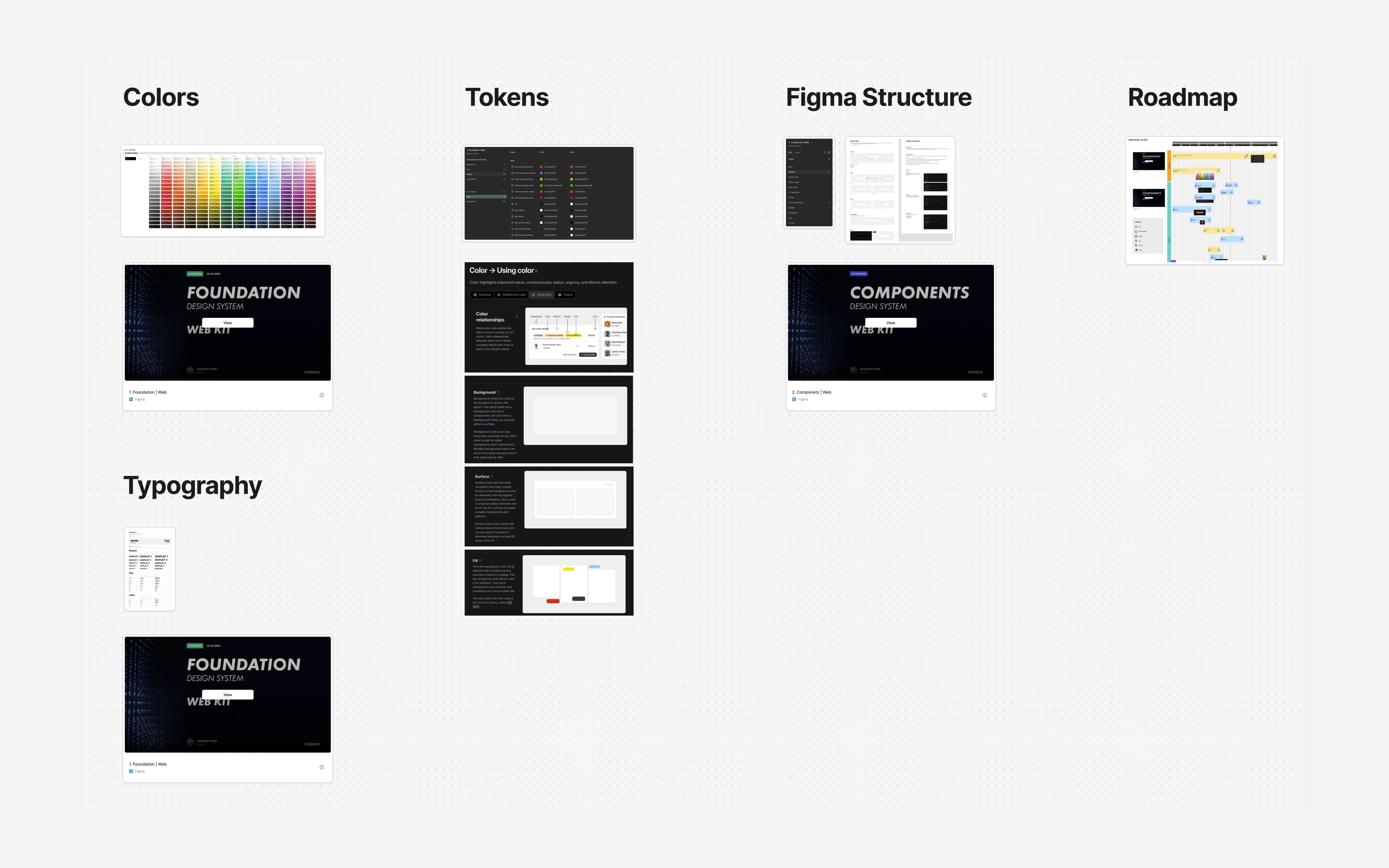
The first decision — and the most consequential — was the token architecture. Nothing in Canal DS references a raw value; it references a token, all the way down. Tokens are the foundation layer of the whole system, covering everything quantifiable: colour, typography (size, weight, line-height), spacing, sizing, radius, border width, elevation, and focus rings.
A token system can be flat (a list of named values) or hierarchical (values that reference other values). Flat systems are easy to understand but don’t scale. As products grow, you end up with hundreds of disconnected tokens and no way to make a global change without touching everything individually.
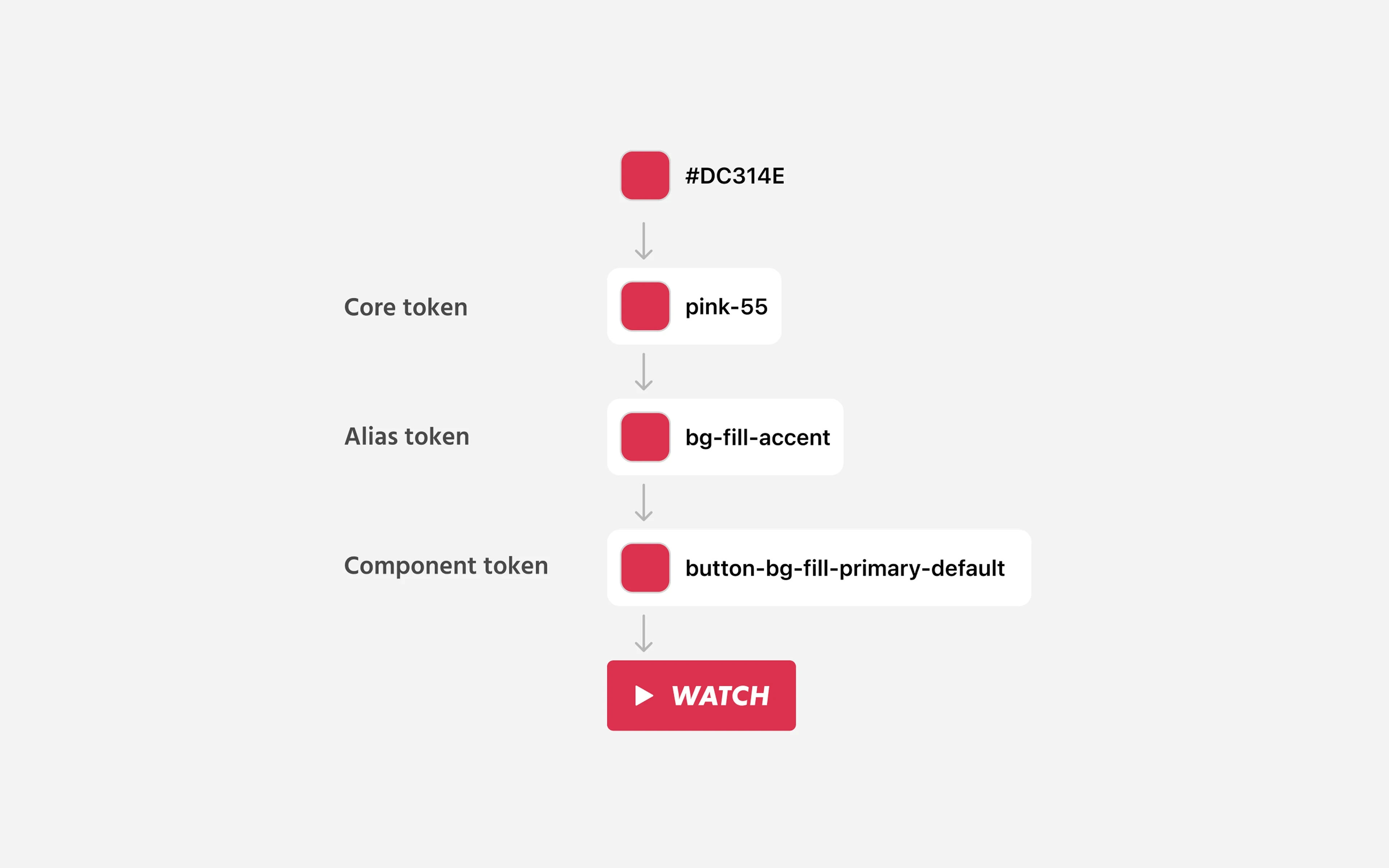
I designed a three-tier architecture, which is what lets one system serve two products and two themes without forking:
Tier 1 — Primitive tokens. The raw values: every colour in the palette, every spacing step, every type size, every border radius. These are named by value, not by usage. red-500, grey-900, space-8. They don’t imply where they’re used — they just define what exists, and are never used directly in a design.
Tier 2 — Semantic tokens. Named by role, not value. action.primary, surface.page, text.body, focus.ring. Semantic tokens reference primitive tokens. This is the layer that carries meaning — and the layer that makes a theme change or rebrand a one-file operation instead of a product-wide find-and-replace. Crucially, which primitive a semantic token points at can change by mode.
Tier 3 — Component tokens. Specific to individual components. button.primary.background, card.border. Component tokens reference semantic tokens. This means a component inherits every theme and accessibility decision for free, and its visual behaviour can be changed at the component level without touching the broader system.
This architecture was designed to survive scale. The overhead of three tiers pays off the moment you need to make a change that crosses component or product boundaries.
Fewer variants, more options
The payoff designers feel daily comes from binding components to semantic tokens and then driving them with variable modes: a theme collection with Light and Dark modes, and a responsive collection across desktop, tablet, and mobile-web breakpoints. A component is built once, bound to semantic variables, and re-themes itself by switching the mode on its frame. I almost never build a “dark version” and a “light version” — those aren’t variants, they’re the same component reading a different mode. A button bound to action.primary, text.on-action, and focus.ring is automatically correct on dark desktop and light mobile web, with its sizing and focus ring resolving from the mode. Variants are reserved for genuine structural difference, so the variant matrix stays small while the number of contexts a component covers stays large.
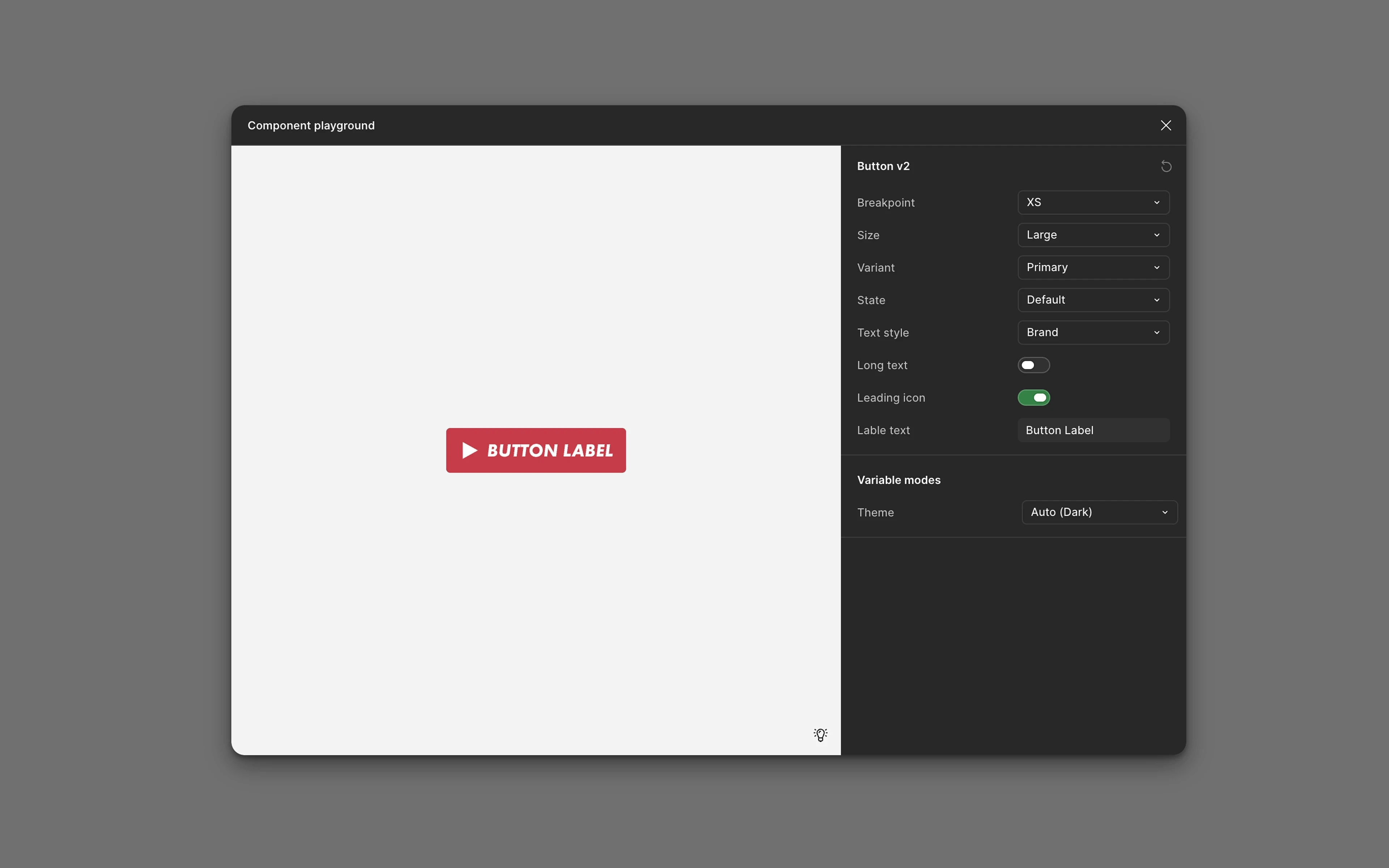
This is also where accessibility becomes structural rather than aspirational. Because failing colour pairs are never exposed as semantic tokens — the brand red, #DC314E, is simply not offered as a body-text value on dark — a designer can’t pick a combination that fails contrast. The token layer is the gate, and the variable modes are the lever.
Building the Component Library
With the token architecture established, I built the library as a four-layer atomic system: foundations (tokens), atoms (Button, Icon, Badge, Input), molecules (OfferCard, FormField, Modal), and organisms (PlanComparison, CheckoutSummary, AccountPanel, customer-service case views). The build happened in phases.
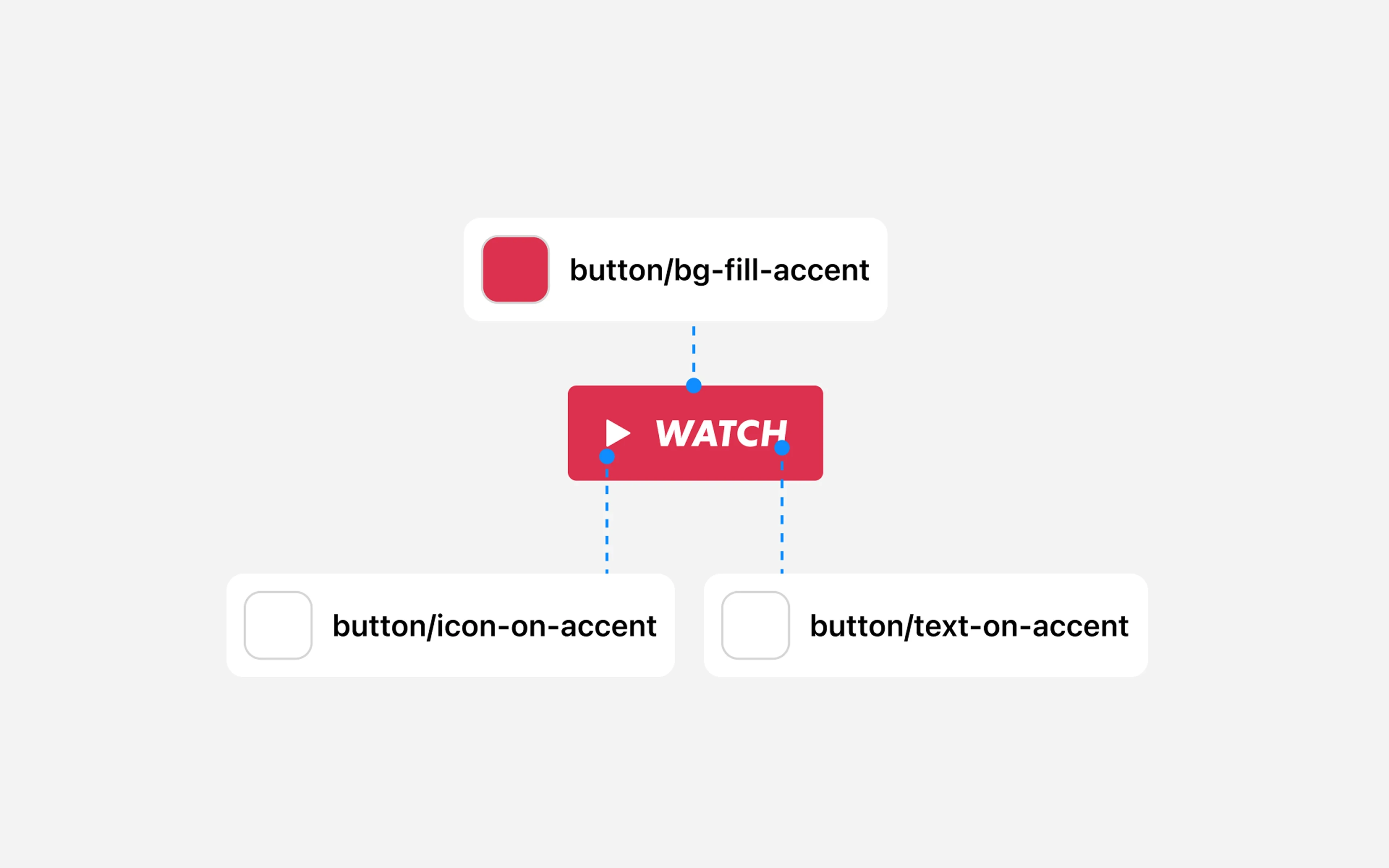
Phase 1 (2023): Foundations. The first 50+ components covered the essential building blocks: buttons, inputs, cards, navigation elements, modals, typography styles, and the basic layout grid. These were the components that appeared in nearly every screen — getting them right and getting them into the codebase was the highest-leverage starting point.
Phase 2 (2024): Expansion. Stepping into the Senior role let me dedicate more time to the system, and the build-out picked up pace. The focus shifted from foundations to product-specific components and complex patterns: offer and plan-comparison cards, the checkout flow, account management, and the panels the customer-service team works in.
Phase 3 (2025–present): Scale and governance. With 150+ components live, the work shifted again — from building to maintaining, governing, and evolving. This phase introduced a formal contribution model and an explicit component lifecycle: Proposed → In Review → Beta → Stable. A component isn’t “done” until it’s documented and graduated through those stages.
Component Anatomy
Each component in the system is documented with:
Anatomy — the named sub-elements and their purpose
Variants — every genuine structural state (theme and breakpoint come from modes, not variants)
Tokens — which component tokens control which visual properties
Usage guidelines — when to use this component versus alternatives
Accessibility notes — WCAG requirements specific to this component
Product notes — where behaviour differs between the e-shop and customer-service surfaces
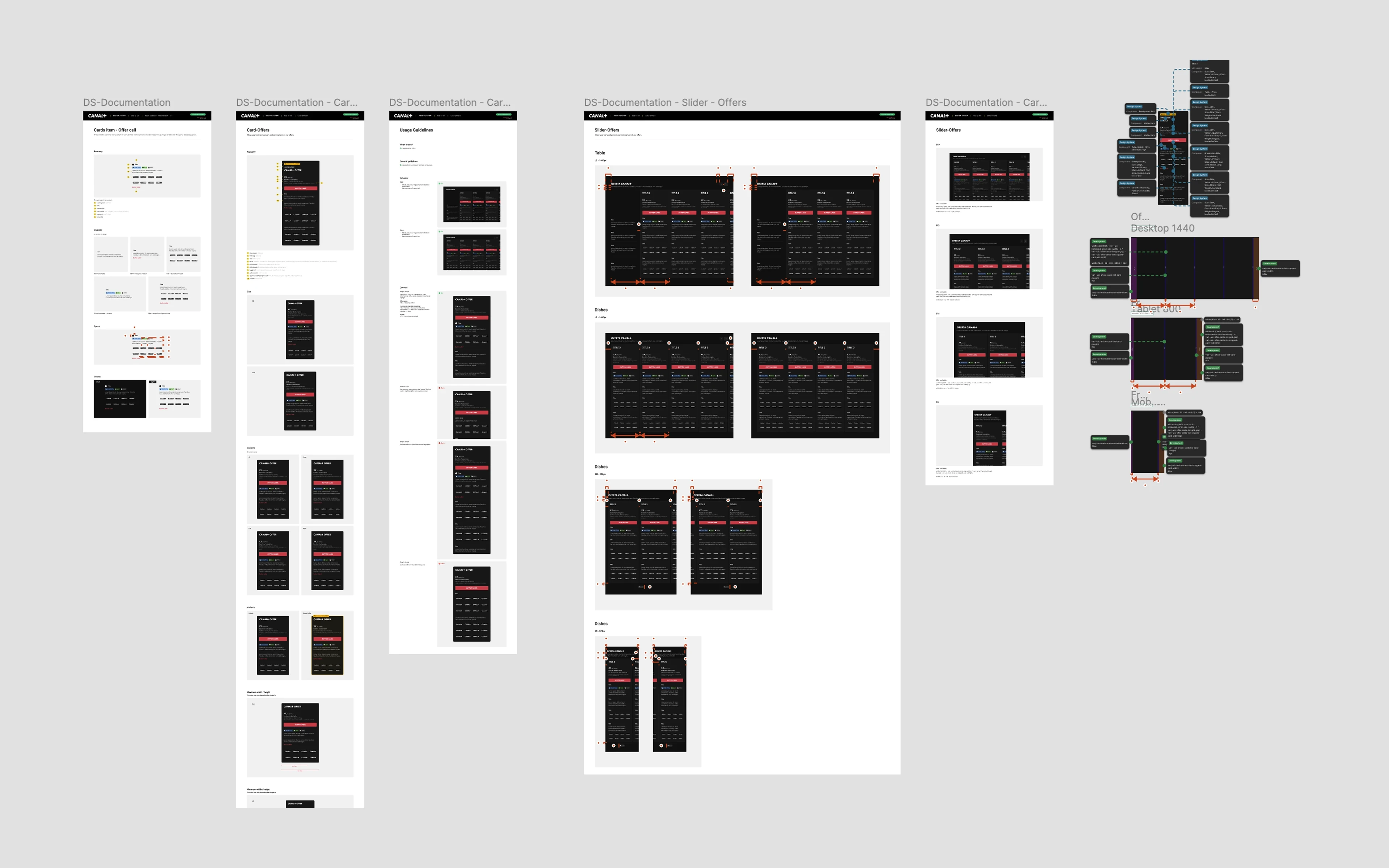
Documentation isn’t optional. An undocumented component is a component that will be used wrong. The Messaging Component is the clearest case of this discipline in practice: a dozen ad-hoc message styles collapsed into one configurable Alert — five intents, two emphasis levels, accessibility built in — so reviews shifted from “how should this message look?” to “which intent and emphasis?” (full case study).
Design–Engineering Collaboration
The design system lives in two places: Figma and code. A system that exists only in Figma is a mood board. A system that exists only in code is invisible to designers. Keeping both in sync is the most operationally demanding part of the work.
I embedded directly with the engineers responsible for implementing the system across the e-shop and customer-service front ends. “Embedded” means working in the same sprints, attending the same standups, reviewing implementation in the same sessions where code was being written — not handing off specs and waiting for results.
The biggest payoff of this working model: drift prevention. The gap between design intent and shipped implementation is not usually caused by engineers ignoring specs. It’s caused by ambiguity — states and edge cases that weren’t specified, responsive behaviour that wasn’t documented, interaction details that seemed obvious to the designer and weren’t obvious to anyone else. Being present in the engineering process meant ambiguities got resolved before they became shipped bugs, not after.
Results & Impact
Scale:
1,000+ design tokens across the three-tier architecture
150+ components across a four-layer atomic model
Single source of truth uniting Canal+ Polska’s digital products
Velocity impact:
After the system was established, time-to-design for standard feature work decreased substantially. Designers stopped making first-principles decisions about spacing, colour, and type on every project — and stopped building a separate component per theme or breakpoint, because modes did that work. Engineers stopped building UI from scratch. The compounding cost of inconsistency began to reverse.
Quality impact:
Visual consistency across the products improved measurably — user complaints about inconsistent UI dropped in support data. The design review process became faster because reviewers could check against the system rather than against their own judgment.
Accessibility:
The design system became the vehicle for WCAG compliance across the products. Because failing colour pairs were never exposed as tokens and target sizes and focus rings resolve from modes, accessibility is enforced by construction rather than retrofitted after the fact. (This work is documented in a separate case study.)
Organisational impact:
The system changed how new designers and developers onboarded. Instead of learning through tribal knowledge and existing files, new team members had documented reference. Because Canal DS uses the product’s own domain vocabulary — Offer, Plan, Checkout, Account — a new engineer or PM could read a spec and recognise their own product. The system reduced the knowledge transfer burden when teams changed.
Challenges
The cold-start problem. Building a design system in an existing product means making a case for investment in infrastructure that produces no user-facing feature. Early on, the system competed with feature work for design and engineering time. I made the case by quantifying the cost of the status quo — duplicated components, inconsistent implementations, rework after launch — and framing the system as a multiplier on feature velocity, not an alternative to it.
Living alongside the Groupe system. Canal+ already had a shared system, DIVE, owned by the France team. The judgment call was constant: which pieces should stay coherent with DIVE — and be contributed back upstream — and which the Polish products genuinely needed to specialise. Running Canal DS as a separate, independently governed system while keeping the general components from diverging without reason was an organisational design problem as much as a visual one. The discipline that kept it honest was the same token-and-review process that kept Figma and code in sync.
Governance at scale. A design system that one person can fully own at 50 components cannot be fully owned by one person at 150 components. Establishing a contribution model and the Proposed → In Review → Beta → Stable lifecycle — how teams outside the core propose additions, how proposals are reviewed, how components graduate from experimental to stable — was a process design problem as much as a design problem. We worked through two iterations of this model before landing on something that worked for the team’s actual rhythms.
What I’d Do Differently
Earlier documentation. In the first phase, I prioritised building over documenting. Components were built and used before they were fully documented. This created a catch-up problem that took significant time to resolve. The lesson: documentation isn’t a post-build task — it’s part of the definition of “done” for a component.
Boundaries before components. Some of the early debates that looked like design questions were really scope questions wearing a costume — “should this even be an Alert?” had no answer because the family hadn’t been named yet. Drawing the boundaries between members of a component family first, as I eventually did with messaging, would have saved several rounds of relitigation.
Earlier stakeholder education. The system’s architecture — especially the three-tier token model and the mode-versus-variant distinction — took time for some team members to internalise. Earlier investment in workshops and working sessions would have accelerated adoption and reduced the period where designers used the system incorrectly simply because they didn’t understand how the tiers and modes related to each other.
Reflection
Design systems are infrastructure. Nobody outside the product team knows they exist. Users don’t see them. Stakeholders don’t demo them. But they are, in a real sense, the most leveraged design work in a product organisation — because everything else gets built on top of them.
The thing I’m most proud of isn’t the 150 components or the 1,000 tokens. It’s that the system is actually used. That’s not as obvious as it sounds. Many design systems are built and abandoned — too rigid, too complicated, or too disconnected from how teams actually work. Canal DS is alive because it was built in partnership with the people who use it, not delivered to them as a finished artefact.
That partnership — between design and engineering, between the system and the features built on top of it — is the real output.