Return from Inactive
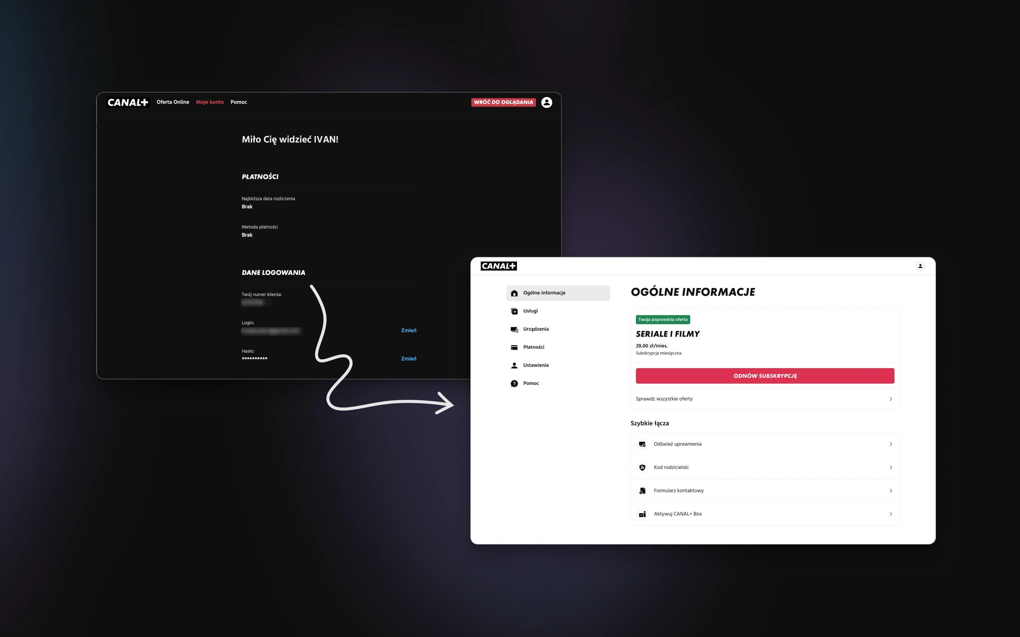
Every month, customers who had stopped paying logged back in — not to the shop, but to their account. That page was built to administer a subscription, not to restart one: the plan that had ended, the invoices behind it, no way forward. So they checked their status and left, and an audience already inside the product was written off and re-bought at full price through paid channels.
Type
Product
Date
2025
Outcome
Lifted purchases by +15%
Background
Every month a slice of customers who had stopped paying would come back and log in. Not to the shop — to their account. Their credentials still worked, and the account area was where they went to check what they still had, when the last payment went out, which devices were still linked.
What greeted them was a record. Everything on the page was accurate and entirely closed — it reported the end of a relationship without offering to continue it. Restarting meant leaving the account area, entering the shop's acquisition funnel, and choosing from scratch a plan they'd already had.
Meanwhile all the selling lived on the shop's homepage — a surface these customers weren't visiting.
This is the design of a layer that recognises a returning customer's history where they actually land, and offers a single, frictionless path back in.
Problem Context
The mismatch was one of place, not persuasion. The offer wasn't missing from the product; it was on the surface built for people who had never subscribed, while returning customers were on a surface built to file their subscription away. The gaps were specific:
No recognition — the lapsed plan appeared as a database fact in a list of records, not as a reference point someone could act on.
No path back — resuming meant exiting self-service, re-navigating the full acquisition funnel, and re-deciding something already decided.
No read on state — the account area adapted to what kind of customer someone was (streaming, satellite, mobile), never to whether they were currently paying, lapsed, or new.
The data team had spotted the behaviour first: a cohort of low-activity accounts logging in, viewing their account, and going no further — no offer views, no plan comparisons, no checkout starts. They were arriving and evaporating. The cost was commercial and quantifiable: an audience already inside the product, already through onboarding and payment setup, being written off and re-acquired at full price through paid channels.
So the project set out to do three things:
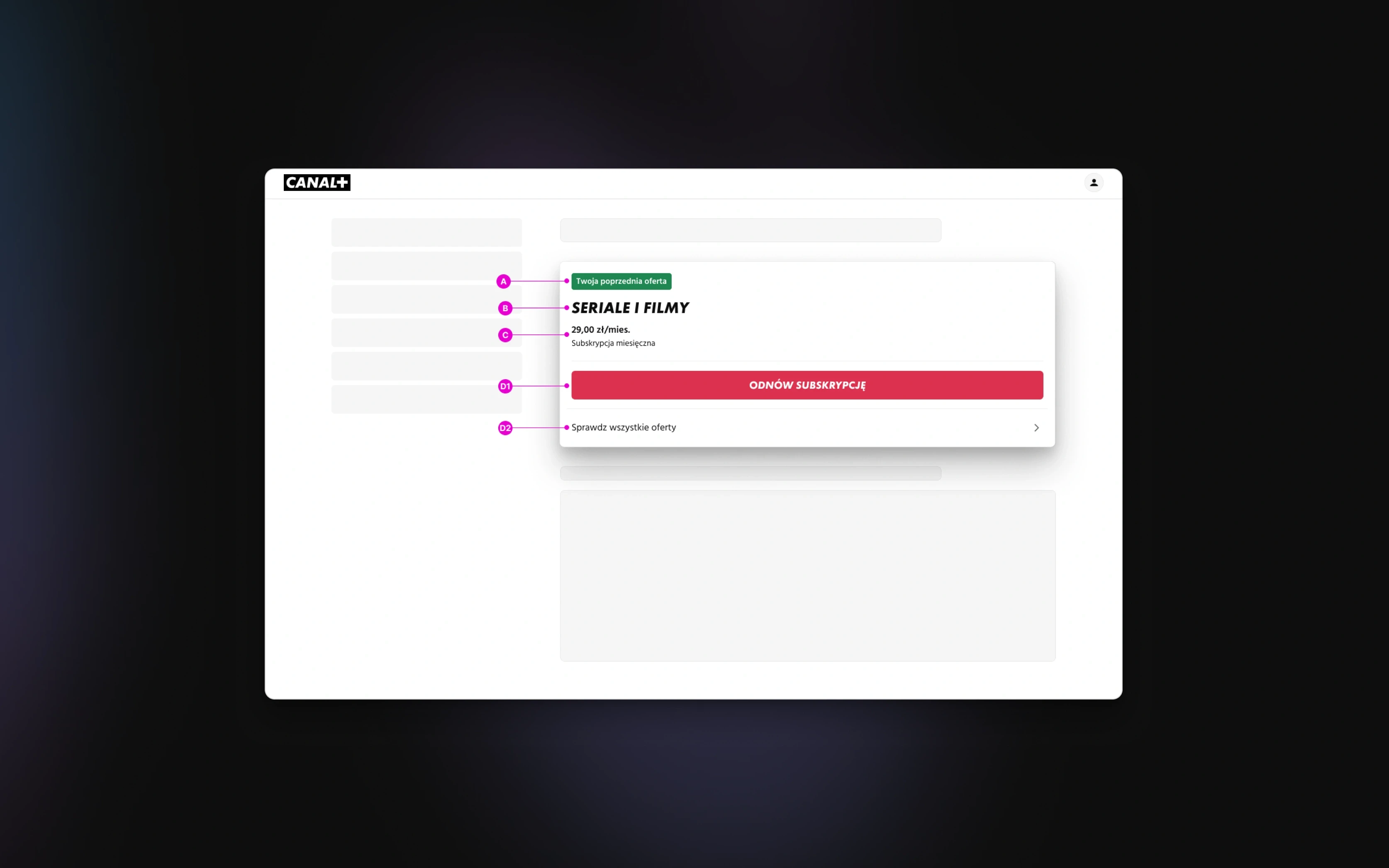
Recognise the returning customer — surface their previous plan as a quiet reference point, so the moment reads as recognition, not a fresh pitch.
Offer one frictionless step — a single CTA into a pre-populated checkout, without a detour through the acquisition funnel.
Ship without disrupting self-service — a modular, segment-gated layer inside an account area that already had to serve streaming, satellite, and mobile customers, appearing only for the inactive cohort.
The offer wasn't missing — it was in the wrong place. Customers who had lapsed weren't browsing the shop; they were logging into their account.
Defining Success
The main goal was commercial: move more returning customers from checking-and-leaving into the offer flow, and more of them through to a completed purchase. Winning back an audience already inside the product costs a fraction of buying a new one, so everything else served that.
The success measures were set before any UI, and deliberately in a pair — entry into the offer flow and completed purchase per visit — so a tile that merely attracted clicks could not be mistaken for one that won customers back.
In experience terms, a returning customer should feel recognised within seconds and reach checkout in one step. Concretely, the component had to earn four things:
A moment of recognition. A contextual headline tied to the customer's history and their previous tier shown as a reference point — the product paying attention, not running a campaign.
One frictionless step. A single primary CTA into a pre-populated checkout, with the right plan already scoped — a backend coordination point settled with PM and engineering before design was final, so a late rework never happened.
No dark patterns. No urgency language, countdown timers, or manufactured scarcity, and a clean, always-available dismiss. A customer pressured back is a customer who cancels again; in the account area — where people come to manage money and settings — anything that smells like a sales trap undermines the one place the product has to stay trustworthy.
Disruption-free delivery. Modular, native to the existing design system, and gated to the inactive cohort — one of the few components with a segmentation rule built into when it shows.
Designs
Each decision answers a specific problem with the old account experience.
The account area recorded the lapsed plan as a fact rather than an offer. So the previous plan became the reference point for a next step — borrowed in spirit, not mechanic, from Amazon's "Buy it again," which meets you where you are rather than at the start of the funnel. Because the hook couldn't always be one specific show, the idea was adapted to the customer's previous plan rather than copied literally.
It wasn't obvious what form recognition should take. So three directions were tested: the Offer Card (a persistent one-click resubscribe banner — direct, but read as commercial and push-y in a self-service context), the History Prompt ("You had Plan X — pick up where you left off?" — warmer, but it tested ambiguously, some read it as "you've been away too long"), and the Re-entry Module (the previous plan as a quiet reference plus one relevant next step, no pressure language). The Re-entry Module tested best: it felt like the product was paying attention, not running a campaign.
"Resubscribe" framed the moment as starting over. So the CTA copy was rewritten to emphasise continuation rather than restart — an invitation, not a transaction. That small shift in tone mattered more than any layout change.
The intuition was that showing the full previous offer — core plan plus add-ons — would convert better. So it was tested rather than assumed, and it didn't hold: showing everything made no real difference and slightly hurt on desktop. The simple tile, presenting one clear decision, stayed.
The segmentation rule was the part that made this reusable rather than a one-off. Defining the boundary — who counts as inactive, and when the tile stops showing — was settled with data science and product before build, which is why the same gating pattern could later carry other personalised surfaces in the account area without renegotiating it each time.
Results
The exact rates and volumes are confidential, but the direction is clear: the re-entry tile moved both numbers that mattered. More returning customers entered the offer flow instead of leaving, and more of them completed a purchase. It shipped as a permanent, segment-gated part of the account area for the inactive cohort.
The pairing of metrics is what makes the result trustworthy. Customers who came through the tile converted at a healthy rate rather than clicking idly — the lift was recovered revenue, not a click-through number inflated by a more visible banner.
The quieter result was on how the team thought. Self-service and selling had been treated as separate territories — support handled the account area, marketing handled the shop. Afterwards there was shared language for contextual surfaces: components that adapt to who the customer is, placed where the behaviour already happens rather than where the funnel says it should. That framing shaped later work.
More information isn't always more persuasive. The simple tile presented one clear decision; the full-offer version presented a more complicated one, and complexity is friction.
What's next. Deeper personalisation — add-ons, richer history — likely belongs at a separate, later step in the flow rather than as more weight on the first moment of recognition; that's the next thing to test.
What could have gone better. The full-offer version was the obvious bet and it cost a round to disprove; a lighter way to pre-test "how much to show" would have reached the simple answer sooner. The History Prompt's ambiguous read also surfaced late — copy framing should have been pressure-tested earlier, since tone turned out to carry more than layout.
Outcome
Commercial. A recognition-first re-entry tile in the account area lifted both offer-flow entry and completed purchases for the inactive cohort — winning back paying customers at a fraction of the cost of finding new ones.
Strategic. The work put a commercial moment inside a self-service surface without cheapening it, and established contextual surfaces — components that adapt to who the customer is — as shared infrastructure.
Lasting. Shipped as a permanent, segment-gated feature, native to the design system, built without urgency mechanics or pressure copy, and a direct companion to the cancel-side retention thesis.