Inside the System
A walk through the design decisions behind Canal DS — colour, typography, iconography, components, and voice, across the Canal+ Polska e-shop and customer-service products.
Type
Design System
Date
2023
Outcome
Enforcing coherence, accessibility and scale by construction
When it comes to UX and product design, I'm particularly passionate about design systems. They're a win on several levels at once: they create a more consistent experience for users, they let designers scale up new features quickly, and they translate into more efficient engineering as well. A well-maintained design system is an enormous benefit to any organisation.
At Canal+ Polska I designed and maintain Canal DS — the design system behind our own products, the e-shop (boutique) and the customer-service tools. (The Groupe later rolled out a shared system in 2025 — DIVE, built by the France team and used mainly for the French boutique and player; the Polish team contributes components to it, while Canal DS, started back in 2023, stays a separate system on Polish timelines.) The system rests on two ideas that shape everything below: the product is dark-first (dark is the primary theme of the Canal+ brand), and every value is a token rather than a hardcoded hex or pixel. The sections below walk through the decisions across a few areas — colour, typography, iconography, components, and voice.
Colour
Defining a colour palette for a design system is a much larger undertaking than it appears. I think about colour in four major groupings:
Brand colours
Greys (neutrals)
UI status colours
Content (merchandising) colours
Accessibility runs through all of them. Every pairing the system allows was vetted against contrast checkers to meet WCAG ratios, and the content colours were additionally tested with colour-blindness tools to make sure categories stay distinguishable.
Brand colours
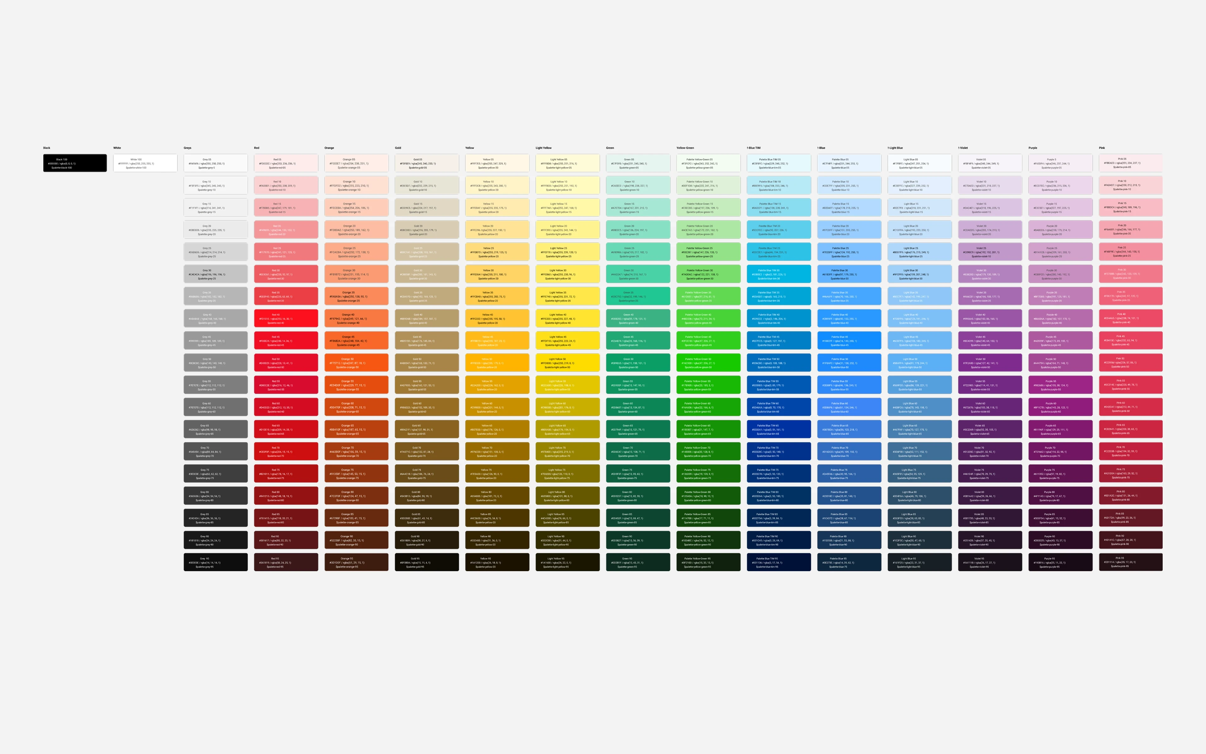
Brand colours are usually where designers have the most fun, but in this case the colour was already decided: the Canal+ brand red, #DC314E, is a Group colour — inherited and fixed, not something I invented. My job wasn't to choose it; it was to turn one given red into a working UI palette that holds up from a phone in the hand to a wide desktop monitor.
So the red became a full tonal scale, holding the hue steady and moving saturation and lightness so every step still reads as the same red. I also associated meaning with it. The most important rule: pink is reserved. It owns the primary action — the Subscribe and Buy buttons — and the focus ring, and almost nothing else. Keeping red scarce is what stops the interface from becoming a wall of competing buttons where nothing wins.
Greys
Dark-first means the greys do most of the work. I established a full scale from near-black to white, labelled in increments of 100 (a common convention for naming gradations in CSS), so anyone reading a spec knows exactly which step is meant.
The page base is a near-black #0E0E0E, not pure black — on purpose. Pure black is harsh and makes elevation impossible to read; a card floating above the page needs the page to be slightly lighter than zero. So elevation climbs in measured steps, page to surface to raised surface to overlay. On a dark theme, the greys do the job that whitespace does on a light one.
UI status colours
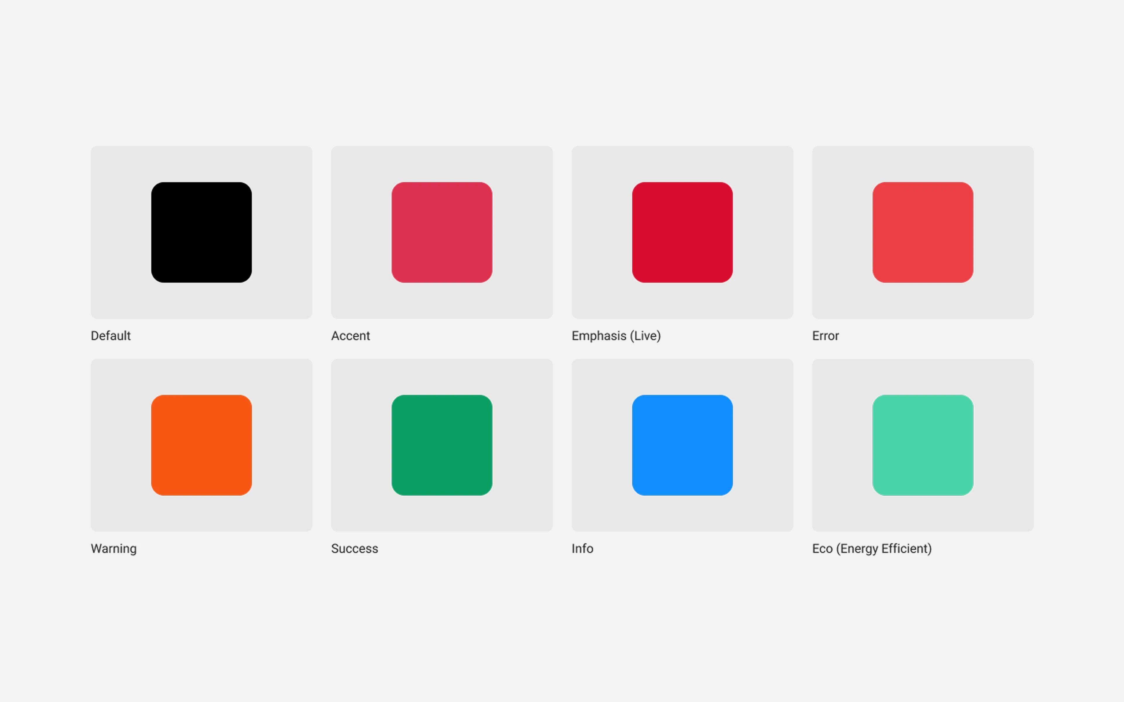
Beyond brand and neutral, the system needs colours for error, success, warning, and info, each calibrated for contrast and resolved automatically per theme. Two choices fall out of the red-led brand. Success is green, so I chose a success green clearly distinct from any brand tone, which means a "payment successful" never collides with the red of a Buy button. And caution is usually shown in yellow — but yellow is one of the lowest-contrast colours and is brutal for text, so I shifted it toward orange for more usable flexibility. Status is never carried by colour alone; it always travels with an icon and a label.
Content (merchandising) colours
A product that merchandises a streaming catalogue has a need most products don't: offers and packages need tagging, and those tags must read clearly in dense plan grids. So there's an extended set, explicitly not for interface chrome — teal for live and sports, purple for exclusive titles, gold for premium tiers. Fencing these off from the UI palette keeps a "premium" accent from ever being mistaken for an interactive element.
Shades and variations
Every colour ships as a small scale, not a single value, so there's always a defined step for backgrounds, hover and active states, and dense tables. Each scale is built in HSL with the hue held constant and saturation and lightness adjusted, then translated to hex — which keeps a colour's identity intact from its darkest step to its lightest. Every step is tested for contrast against white, black, and the neighbouring steps, so a lighter shade can safely back darker text.
Tokens and variables — the engine of the system
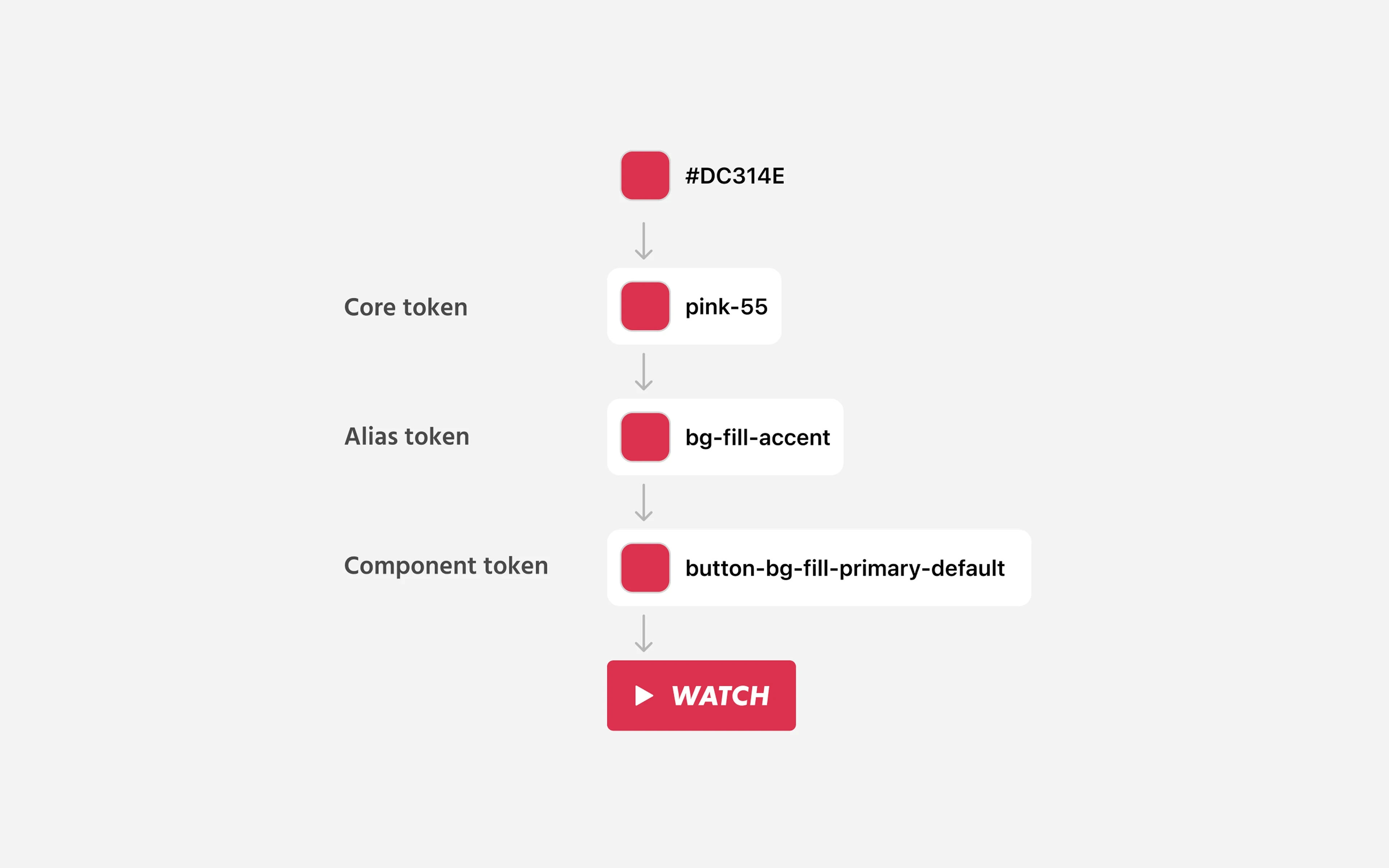
Everything above is really setup for the most important decision in Canal DS: nothing references a raw value — it references a token, all the way down. Colour is just the most visible example. Tokens are the foundation layer of the whole system, covering everything quantifiable: colour, typography (size, weight, line-height), spacing, sizing, radius, border width, elevation, and focus rings. This is the decision the entire system rests on, and it's worth being precise about why it pays off.
The architecture is three tiers, which is what lets one system serve two products and two themes across every breakpoint without forking:
Primitives — the raw, context-free values: the full red ramp, the grey scale, the type sizes, the spacing units. Named for what they are (
grey-900,pink-500,space-8) and never used directly in a design.Semantic tokens — the meaning layer that designs actually consume:
surface.page,surface.raised,action.primary,text.body,focus.ring. Each points at a primitive — and crucially, which primitive it points at can change by mode.Component tokens — the narrowest layer, scoped to a component (
button.primary.background,card.border). They reference semantic tokens, so a component inherits every theme and accessibility decision for free.
Fewer variants, more options. This is the payoff designers feel daily. In Figma, the semantic tokens are variables organised into modes — a theme collection with Light and Dark modes, a breakpoint collection with Desktop, Tablet, and Mobile modes. A component is built once, bound to semantic variables, and then re-themes itself by switching the mode on its frame. That means I almost never build a "dark version" and a "light version" of a component, or a separate component per breakpoint — those aren't variants at all, they're the same component reading a different mode. A button bound to action.primary, text.on-action, and focus.ring is automatically correct on dark desktop and light mobile web, with its sizing, touch target, and focus ring all resolving from the active modes. Variants are then reserved for genuine structural difference — icon on or off, with or without an action — so the variant matrix stays small while the number of contexts the component covers stays large. Without tokens, "five intents × two themes × three breakpoints × four states" is a combinatorial explosion of hand-built variants; with tokens and modes, it's one component and a mode switch.
Change the style with one click. Because every value lives in exactly one place, a change propagates everywhere at once. Adjust the brand red, or the page base, or the focus-ring thickness, and every screen across both products updates instantly — no find-and-replace, no missed instances. Switching a single frame from Dark to Light, or from Desktop to Mobile, re-skins the entire layout in one move. A seasonal re-theme, a contrast tweak, or a full rebrand becomes an edit to a handful of primitives rather than a sweep through hundreds of files.
This is also where accessibility becomes structural rather than aspirational. Because the failing pairs were never exposed as semantic tokens — brand red is simply not offered as a text.body value on dark — a designer can't pick a combination that fails contrast. The token layer is the gate, and the variable modes are the lever: consistency and accessibility are enforced by construction, and restyling is a single, safe move.
Typography
Like colour, typography reinforces brand identity, and consistent, well-structured type is essential to any interface. It breaks down into a few decisions: font selection, text sizing, line-height, and responsive considerations — with the added challenge that this type has to read comfortably from a phone in the hand to a wide desktop monitor, in a language full of diacritics.
Font selection
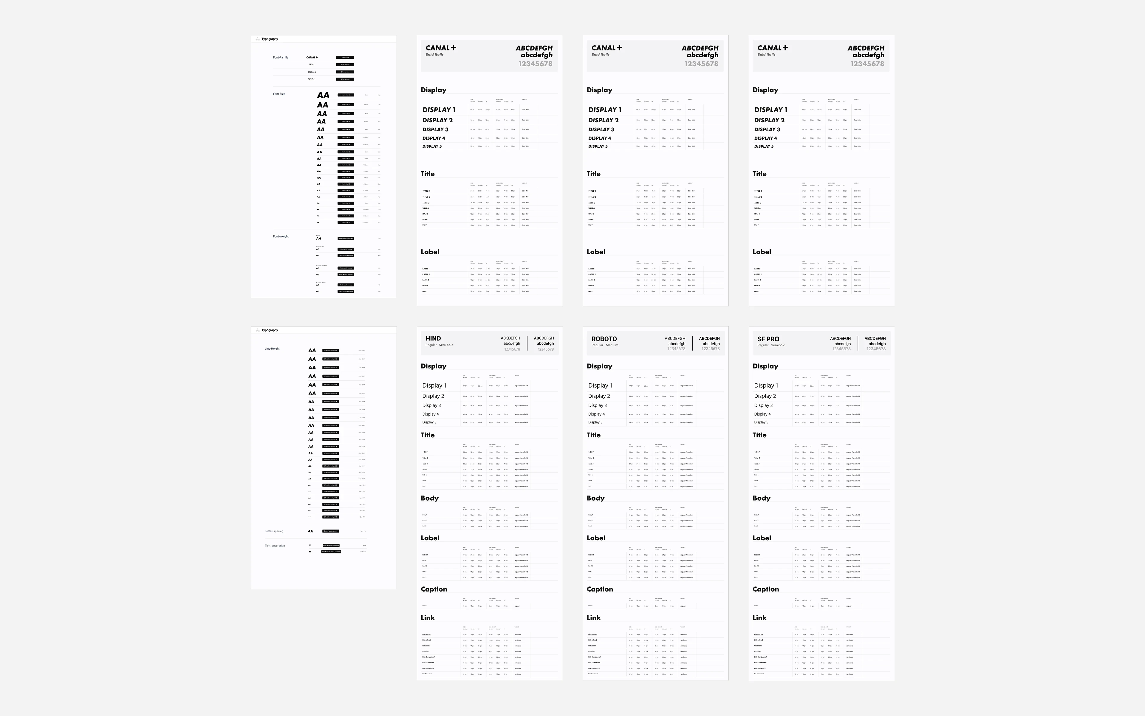
Many brands do well with a single workhorse font; a product that both sells and informs earns two. Canal DS runs two registers, and which one you reach for is a choice per context. Canal+25 Bold Italic is the brand voice — marketing heroes and offer headlines, the moments where the product is selling. Hind is the system voice — the default for UI, forms, plan details, and settings — chosen partly because it covers the full Polish character set (ą, ć, ę, ł, ń, ó, ś, ź, ż), which is non-negotiable for a Polish product. Both share the same token structure, so a heading slot can render in either without breaking layout.
Text sizing
I set explicit sizes for each header level rather than deriving them from a single rule, with a defined body size and a couple of body variations (and lighter greys) to convey relative importance — emphasising an offer headline, de-emphasising a billing disclaimer. There are three weights: regular (400), bold (700), and a medium (500) in between — useful for emphasising a single word, a header, or one column in a table without fully bolding it.
Line-height
One detail that often gets overlooked is line-height. Setting a single ratio like 1.5× across the board seems tidy but is wrong: large headers usually look best with a much tighter line-height than body copy. So rather than a multiplier, I defined an explicit line-height for each size, kept to a 4px rhythm, which gives more predictable spacing when text sits next to icons, inputs, and other UI elements.
Mobile & responsive
Default body is 16px, which is also the size below which mobile Safari auto-zooms on form inputs — so holding inputs at 16px avoids that jarring zoom in checkout and account forms. Conversely, large headers that look great on a desktop are scaled down for small screens — the relationships between sizes change with the viewport, so each breakpoint is encoded as a mode rather than a blunt multiplier. On web, the floor is concrete: text stays functional at 200% zoom.
Iconography
There are plenty of pre-made icon sets that are sufficient for many products. In our case, the product has its own vocabulary — subscription tiers, channel and package logos, payment and billing, devices, profiles, promotions — that a generic set plus one-offs would render inconsistently. So rather than stitch something together, I drew a custom icon set myself, specific to Canal+.
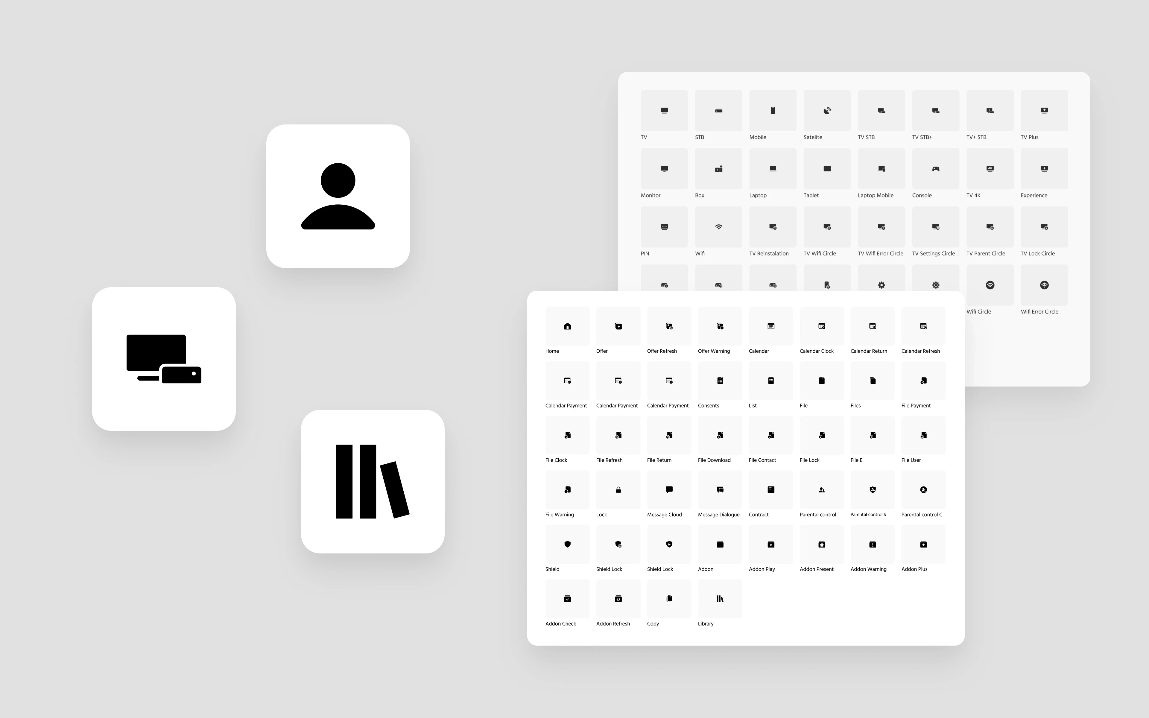
Most icons need an accompanying label or context to be clear, and they have to stay legible from tiny inline sizes up to large feature and empty-state icons. I drew each one on a consistent square canvas in pure vectors, and held to a few rules:
Keep clearance from the edges. Each icon keeps a couple of pixels of buffer on every side, so it never touches the canvas edge. This stops icons from crowding adjacent text and keeps them at roughly the visual weight of the letters beside them.
Make some icons deliberately smaller. A shape that fills the whole canvas can look oversized — a dropdown chevron, for instance, reads far better at a reduced size.
Use one stroke weight with rounded joins. A consistent line width keeps the set coherent and roughly the weight of the text. The exception: a few action glyphs like "+" and play/pause get a heavier stroke, because a thin "+" looks weak as a control.
Build from simple shapes, then outline. Drawing with overlapping lines and basic shapes (union/subtract) keeps the set consistent, and outlining every stroke ensures the icons scale cleanly and stay small files.
Optical centring over literal centring. A mathematically centred glyph often looks unbalanced, especially inside a circle. I checked balance by dropping a slightly inset circle over each icon; the classic offender is "share," which needed a 1px nudge left to actually look centred.
Sizing is tokenised, with a larger ramp for feature and empty-state icons. Most icons travel with a text label; the exceptions are universal glyphs (close, check, chevron) and dense surfaces like comparison tables or toolbars, where space is scarce and frequent users learn the vocabulary. Icon-only controls always pair with an accessible label and a clear focus state, since for keyboard users the focus ring is what tells you which control is live.
Components
The basic building blocks above become powerful when they're combined into reusable components, composed atomic-style up the four layers. There are a few aspects to component design worth walking through: defining variables, creating components, refactoring, and nesting.
Defining variables
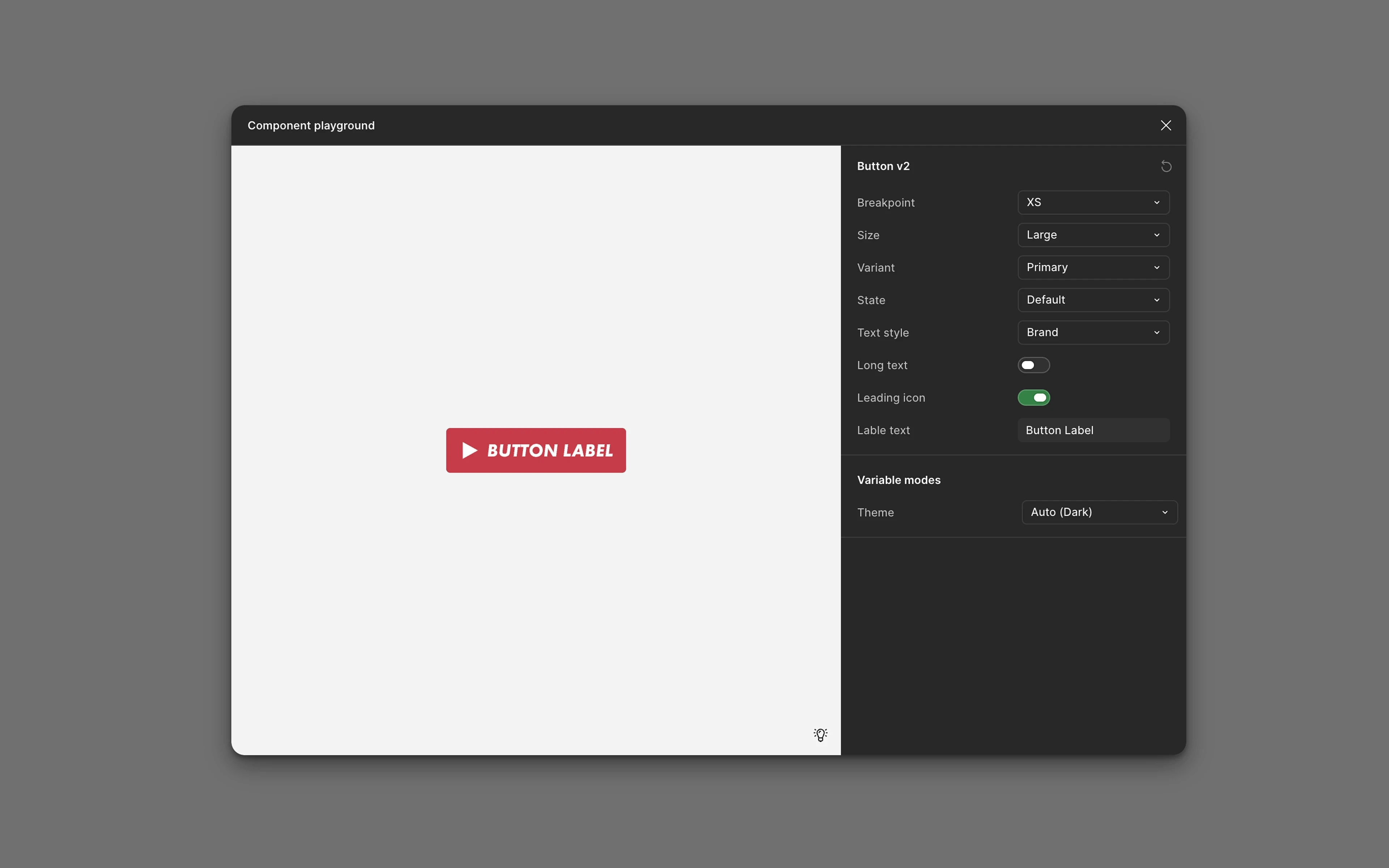
Each component exposes only the variables it actually needs — and here the token work pays off again. Because theme, breakpoint, and most states resolve from semantic tokens and modes, they're not variants. The button doesn't need a dark variant or a per-breakpoint variant; it reads action.primary and the mode supplies the rest. What's left as actual variants is genuine structure: icon on, off, or swapped; primary (solid) versus secondary (outline); alternates for use over a marketing image or for destructive and confirming actions. That keeps the variant set small and configurable instead of a sprawling matrix. The colour discipline carries inside the component too: a ghost button's text is bound to a neutral text token, never red, because red is reserved.
Creating components
Beyond the defaults every product needs — buttons, inputs, tables, modals — the system extends into pieces specific to the product, like the offer card and the plan-comparison table. I design these "kitchen sink": with the maximum content they could ever carry, then use variables to hide what a given context doesn't need. Hiding an element in Figma is easy; adding one to every instance later is not.
Refactoring as needed
Restraint usually shows up as drift. The temptation with variants is to keep adding axes until one "super button" carries dozens of variations and nobody can configure it correctly — at which point it's a signal to split. I kept the two type registers as separate, clearly-named components rather than a hidden toggle, because a hidden switch invites someone to ship a marketing-italic button inside a billing form. The opposite happens too: when the same offer card had diverged across the e-shop and customer-service surfaces, I audited the versions and refactored them back into one component that shows or hides content by context — which cut duplication for both design and engineering.
Nesting components
Components nest, atomic-style: atoms compose into molecules, molecules into organisms, and larger reused chunks — a full checkout step, an account section — become components of their own. This speeds feature work and makes inconsistency obvious when it appears. Accessibility lives in the spec, not the QA pass: a button below the 44px touch-target minimum carries invisible padding to hit the target without changing its visual height, and every interactive component carries a clear, consistent focus ring, because for keyboard users the focus ring is the navigation. A component isn't "done" until it's documented and graduated through explicit lifecycle stages — Proposed → In Review → Beta → Stable.
Additional guidelines
A comprehensive library makes new work far more efficient, but it requires rigour in how it's used. A few principles keep it that way:
Always use tokens, never manual values. Never type a hex or a pixel size — always pick a defined token. The moment manual values creep in, you lose the core benefit and invite drift. If you need something that isn't a token, that's a sign to add one, under review.
Rely on components as much as possible. An ideal screen is existing pieces composed together, with only text and a few tokens changed. If something is genuinely new, build it as a proper component anyway — a future project will likely need it.
Don't overcomplicate components. Stuffing one component with hundreds of variables makes it slower to use, not faster. Split along clear lines of function or content, sharing a common base where it makes sense.
Be strict about new components at the bottom of the stack. New atoms are the core team's call; the stricter that gate, the more coherent everything built on top stays.
Respect the surface. Desktop has hover and keyboard focus; mobile web has neither hover nor a mouse, and needs generous touch targets and thumb-zone placement. The system encodes those as modes and overrides rather than pretending the surfaces are the same.