Shorts for CANAL+
A premium vertical shorts experience, designed for the way people actually hold their phones.
Type
Product
Date
2025
Outcome
Lifting conversion, retention and time-in-app
Background
Waiting for a match to start. Half-watching on the sofa. Killing five minutes in a queue. These are the moments people reach for their phone — and for years CANAL+ had nothing to meet them there.
The app’s short video lived in a horizontal player you scrolled past, while every great vertical clip the company made — the last-minute goal, the post-match interview, the behind-the-scenes moment — went straight to TikTok and Instagram. CANAL+ was paying to produce its most mobile-native format and handing the attention to the platforms it competes with.
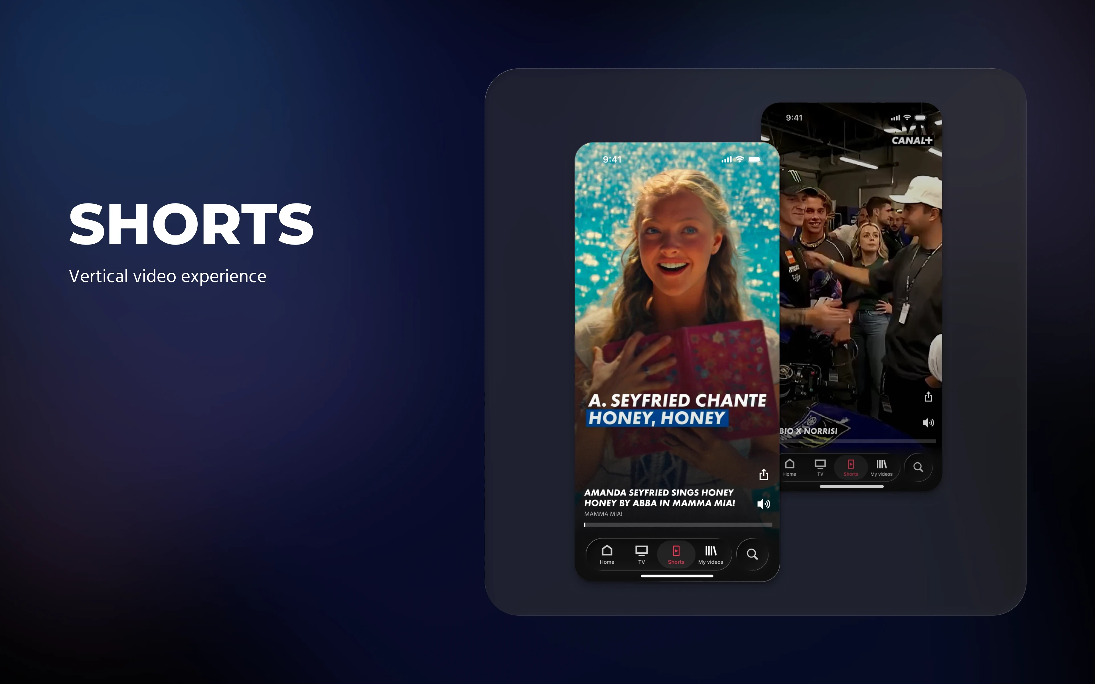
This is the design of Short Video Player V2: a full-screen, swipe-to-browse shorts feed that feels as fluid as the apps people already live in, but unmistakably premium and unmistakably CANAL+.
Wrong format — a horizontal, 16:9 experience you scrolled past rather than fell into, on a surface people hold vertically.
A dead end — a clip ended and the journey stopped; nothing carried a viewer onward to more content or to a subscription.
Exported value — the best vertical content went out to social every day and was absent from the product that paid to make it.
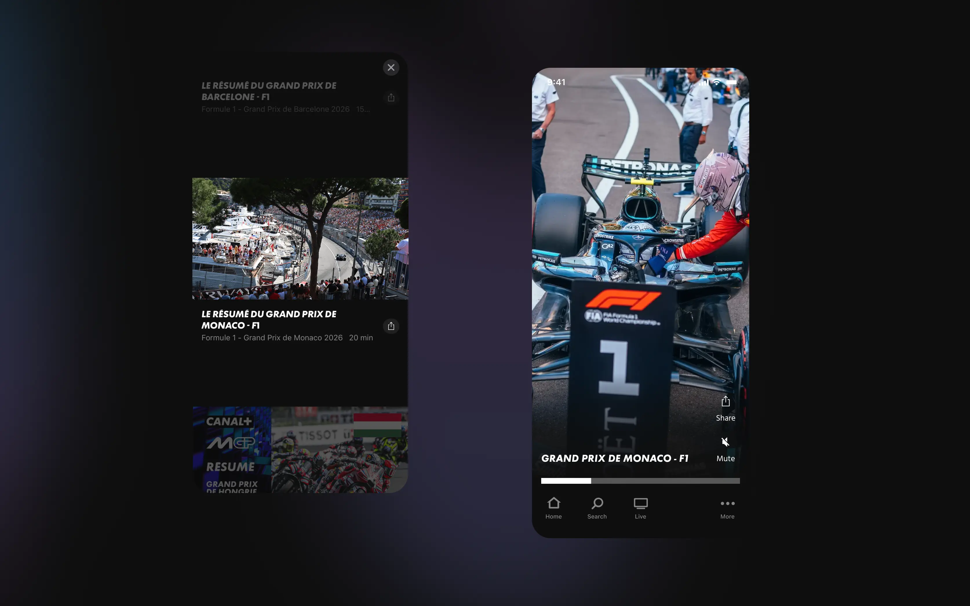
The strategic cost sat behind all three: short video is how many people first meet CANAL+, and that first taste was being spent on someone else’s platform instead of doing the one job that mattered most — turning prospects into subscribers.
So the project set out to do three things:
Bring the format home — a vertical, full-screen feed that matches how people actually watch on mobile.
Open a way through — an onward path from a clip toward more content, and for prospects, toward subscribing, so the format stops dead-ending.
Ship something premium and reusable — a lean player free of borrowed social bloat that other markets and surfaces can build on.
The job wasn’t to invent something new. It was to bring home what we were already making for everyone else.
Defining Success
The main goal was commercial: turn the first taste into subscriptions. Short video is a primary way prospects meet CANAL+, so the format’s real job is to carry that first watch toward a subscription — everything else served that.
In experience terms, that meant getting someone from “I have a minute” to “I want to watch that“ with as little friction as possible. Concretely, the player had to earn four things:
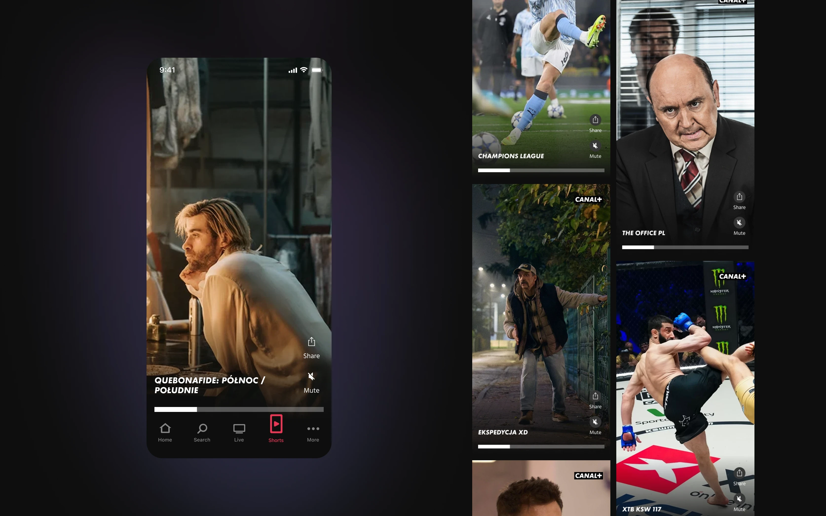
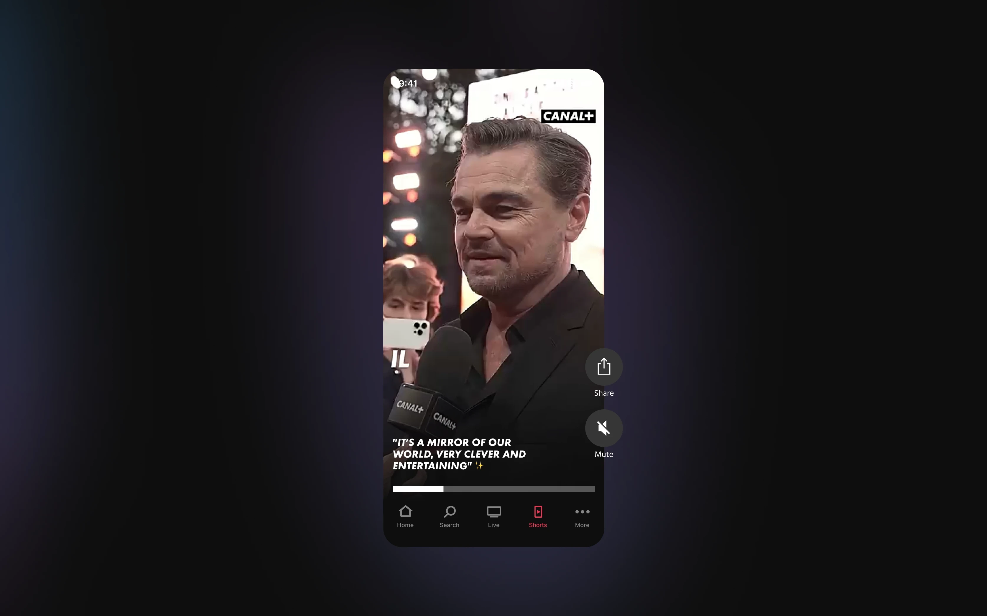
Zero learning curve. Full-screen, autoplay, vertical — no chrome to learn, no rotating the phone. The content is the interface.
A native share. One tap to send a clip to a friend — the behaviour people already do on every other app, finally native here.
An onward path. When a clip lands, the player carries the viewer onward — toward content, and for prospects toward subscribing — instead of dead-ending. That path to subscription is the format’s reason to exist.
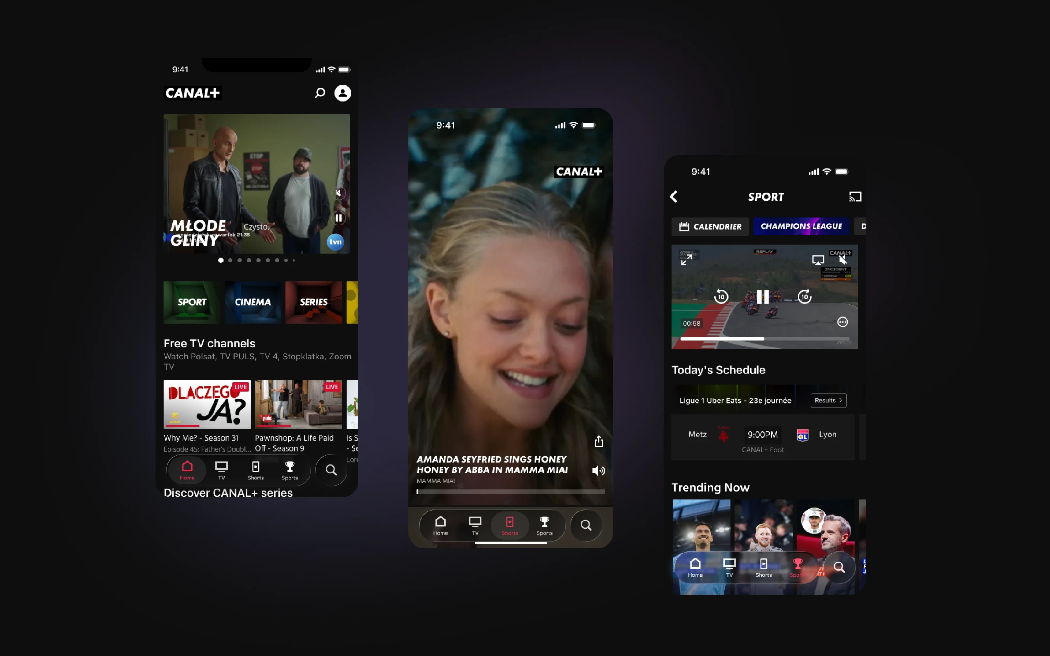
Two ways in. A dedicated shorts space for when people come looking, and autoplaying vertical rows woven into existing pages for when they stumble across it mid-scroll.
Designs
The whole player came down to one discipline: knowing what to leave out. Each decision answers a specific temptation to add more.
Every social app crowds the right edge with like, comment, save, follow — and copying it felt safe. So the controls were stripped to what’s real: CANAL+ didn’t have the community behind half those buttons, and a premium product can’t carry controls that do nothing. What’s left is mostly the video, with the rest held in reserve for the day a behaviour earns them.
The brief was built around the riskiest feature. The project was named after a “bridge” — shorts as teasers that hand off to the full match or film — but it depended on deep linking the backend couldn’t promise in time, and chasing it would have chained the whole release to its riskiest part. So the order was flipped: ship a flawless core loop now, build the bridge later.
Sequencing that risky call needed proof, not a meeting. So the loop — swipe, watch, share — was prototyped as a complete experience with no onward link at all, letting people feel how good it was on its own. That gave the Product Owner the confidence to defer the headline feature without the release feeling hollow. The feature the project was named after went to the backlog; the loop became the product.
The architecture question — fold the new player into the old one or keep them separate — didn’t need forcing on day one. So the two stay separate for now, but the UI was built format-agnostic, keeping a future merge a free choice rather than something the design quietly took off the table.
Results
Exact figures are confidential, but the direction is clear: after launch, people watched more short video in-app and stayed longer. The format that had been quietly leaking attention to other platforms started pulling its weight at home.
Because the player was built lean — premium, format-agnostic, no borrowed social bloat — it became something the company could keep building on rather than a one-off. Other markets are now exploring their own version.
What’s next. This is the first chapter, not the whole story. The bridge to long-form is still ahead, and the leaner the core stayed, the more room there is to grow it — into onward journeys, discovery surfaces, and the in-app community behaviours vertical video makes possible. The point was never to copy social apps, but to give a premium product its own honest version of it.
What could have gone better. The brief over-promised on the bridge; splitting the work into phases sooner would have set expectations before they drifted. And keeping two separate players was the pragmatic move, but it leaves real maintenance debt — the design keeps a merge possible, but possible isn’t solved.
Outcome
Engagement. In-app short-video watch time and session length rose after launch — the format finally performing inside the product instead of on social.
Strategic role. A native onward path turned short video into a route from first taste toward subscription, the job the format exists to do.
Reusability. A lean, premium, format-agnostic player became a foundation other CANAL+ markets are now building their own versions on.