Designing messaging components
The product had twelve ways to say "something went wrong" and no agreement on any of them. This is how messaging found one voice — starting with the Alert, the element it leaned on most.
Type
Design System
Date
2025
Outcome
Cutting duplication, speeding reviews and baking in accessibility
Background
Every product accumulates messaging the same way: a success banner here, a red error box there, a gray info note someone added under deadline. Each one solved its moment, and none of them knew about the others.
Over time that left the interface speaking in different dialects — the same meaning rendered a dozen different ways, with no shared color, icon, spacing, or name, and no guidance on which to use when. Teams kept rebuilding the same message because nothing was named or documented.
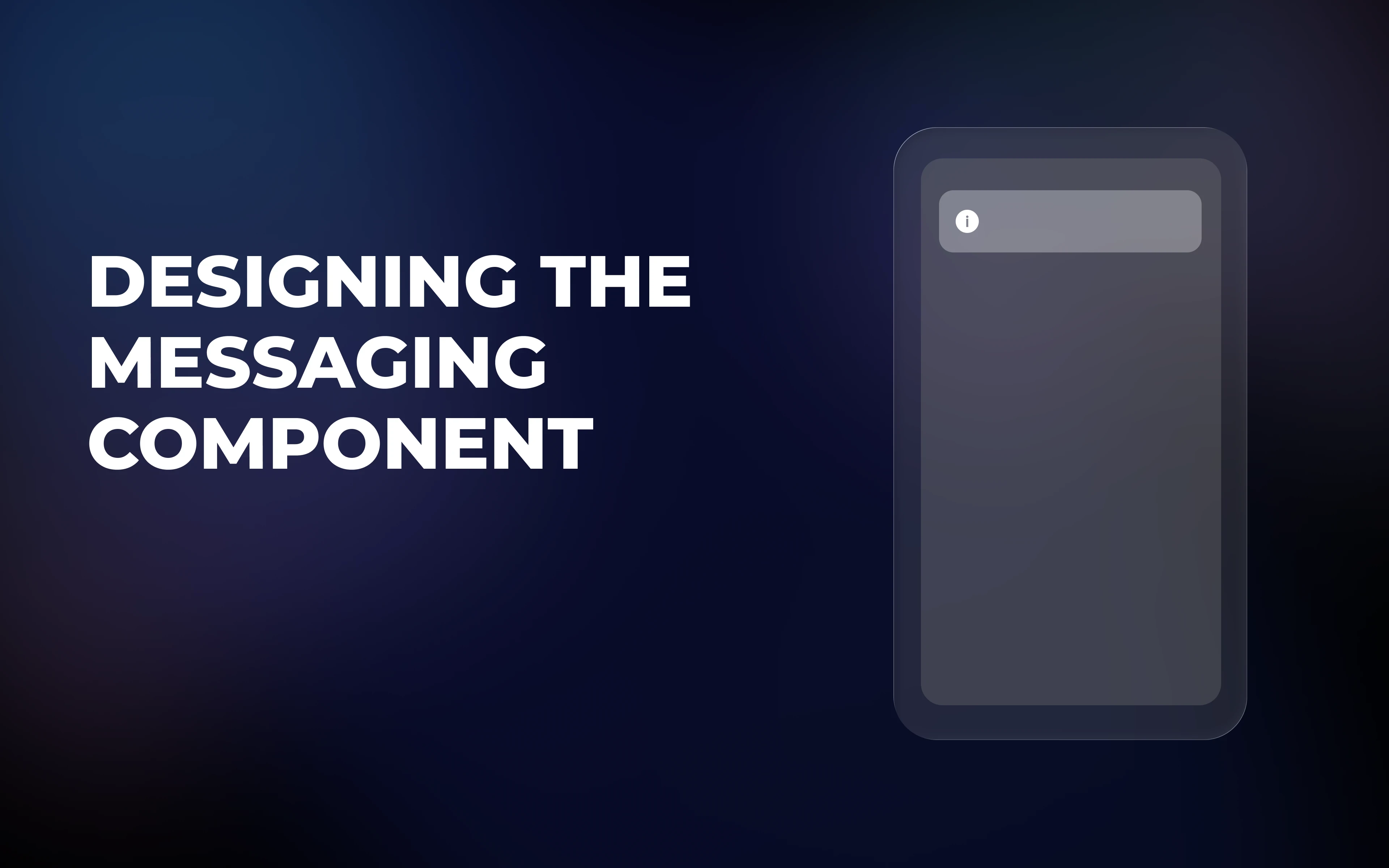
Messaging is a family of elements — Alert, Banner, Toast, Dialog, inline validation. The Alert is the in-context member and by far the most frequently used, so it was the place to start: consolidate that tangle into a single, flexible, documented component, anchored in a clearly defined family.
Problem Context
Feedback messaging had grown organically, so the same meaning looked different on every screen: at least a dozen ways of telling users something — success banners, red error boxes, gray info notes, one-off toasts. The problems underneath were specific:
No shared visual language — three different reds for “error,” mismatched icons, varied spacing and radius for near-identical messages.
No shared vocabulary — “notification,” “alert,” “message,” “banner,” and “flash” all referred to overlapping things.
No guidance on when — the same situation got solved differently by different people, so the pattern couldn’t scale without a designer in the room.
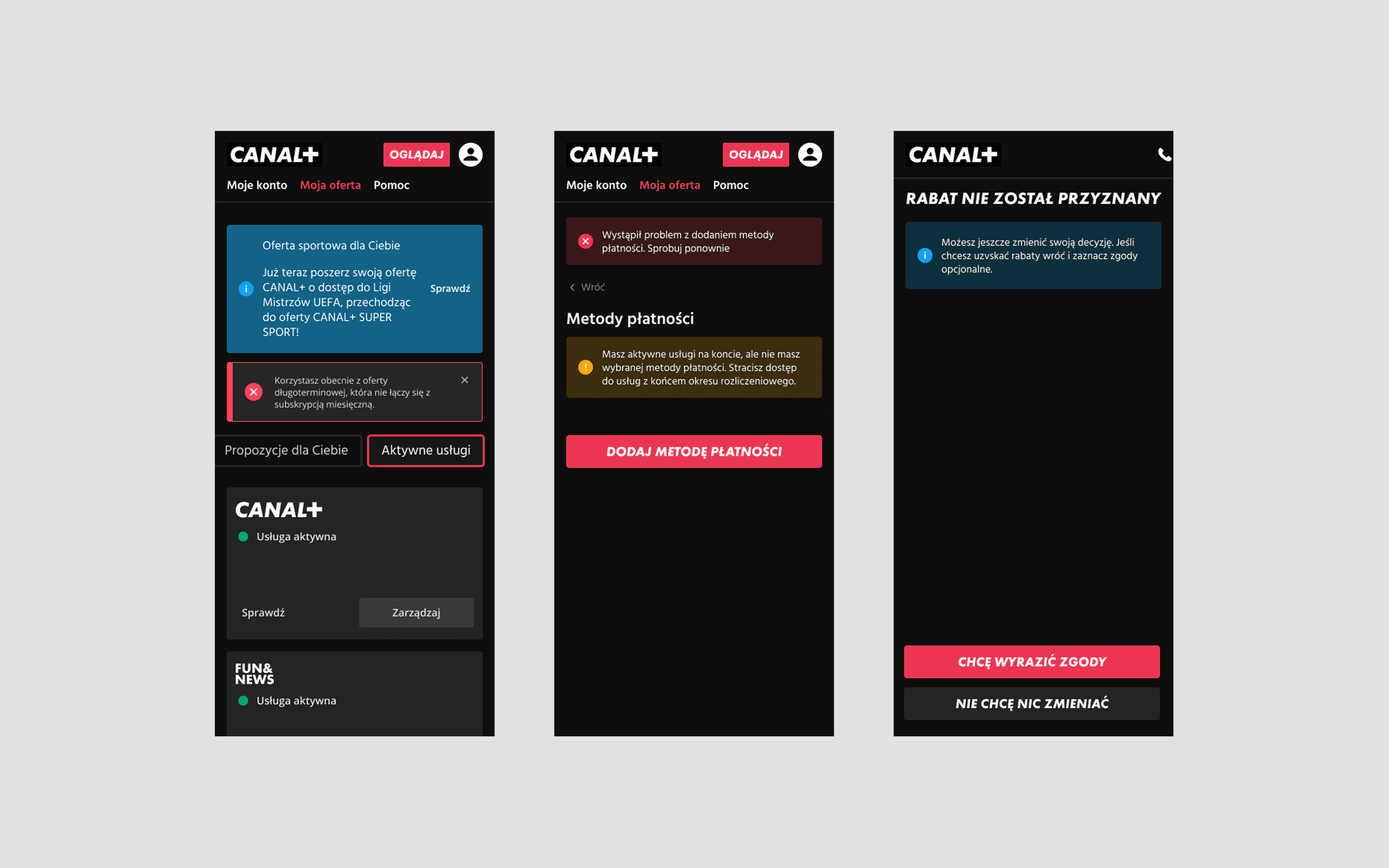
The cost wasn’t just visual. Reviews relitigated the same look every time, accessibility was an afterthought, and engineers reverse-engineered screenshots instead of building from a spec.
So the project set out to do three things:
Define the family — name the messaging members and the boundaries between them, so scope stops creeping.
Build the most-used member first — a single Alert (the in-context, most frequently used element) covering the real range of needs, not a fork per screen.
Document the “when” — guidance that answers “which one, and when?” so the pattern is used correctly without a designer present.
The fix wasn’t a dozen new components. It was one well-structured component for the in-context case — plus a clear map of how it relates to its siblings.
Defining Success
The main goal was consistency through a single source of truth: one in-context component that every team configures rather than rebuilds. Everything else served that.
In practice, success meant a reviewer’s question shifting from “how should this message look?” to “which intent and emphasis?” Concretely, the component had to earn four things:
Clarity of intent. A user instantly reads whether a message is info, success, warning, or error — without relying on color alone.
Reusability. One component covers the real range of needs, no forks.
Accessibility, built in. Meaning survives color blindness, low vision, and screen readers as a property of the component, not a later patch.
Self-serve guidance. Documentation answers “which one, and when?” so the pattern holds beyond the people who built it.
Designs
Each design decision answers a specific problem the audit exposed.
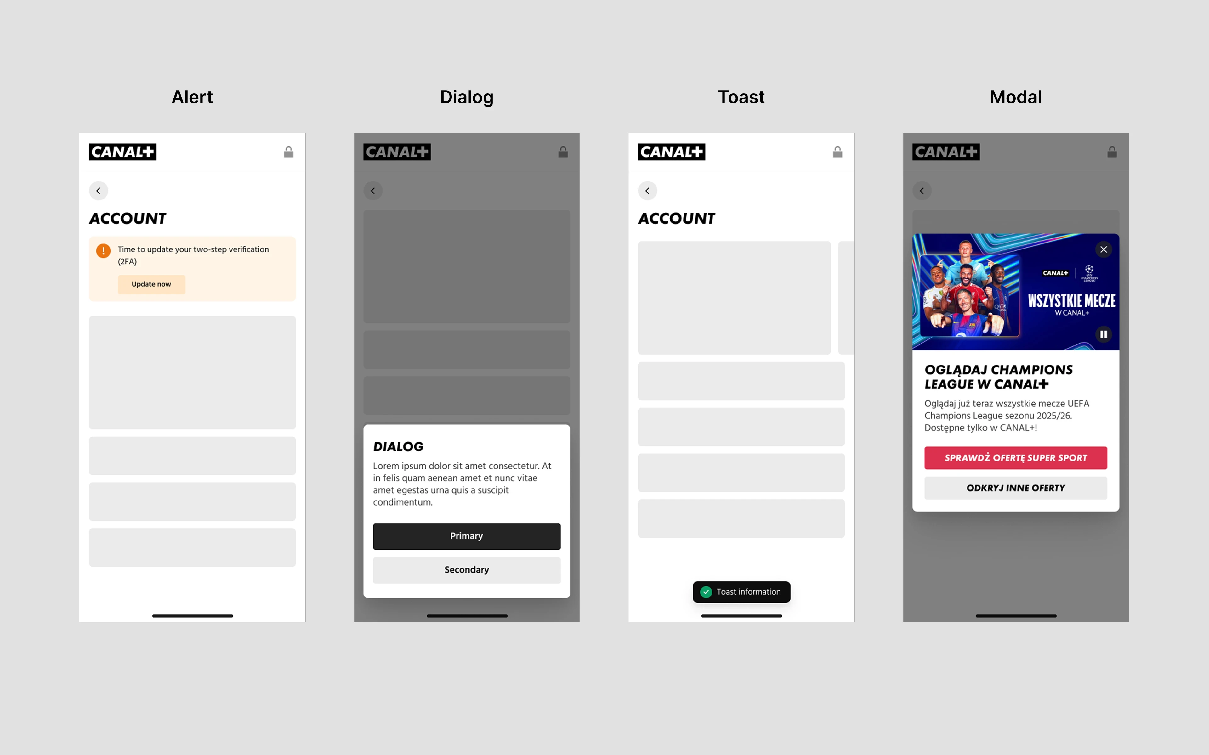
The same meaning had no boundaries — “should this even be an Alert?” had no answer. So the family was named and bounded first: Alert (in-context, persistent), Banner (global), Toast (temporary), Dialog (blocking), inline validation (field-level). If it’s in-context and persistent, it’s an Alert; otherwise it belongs to a sibling — which also settled the naming debate.
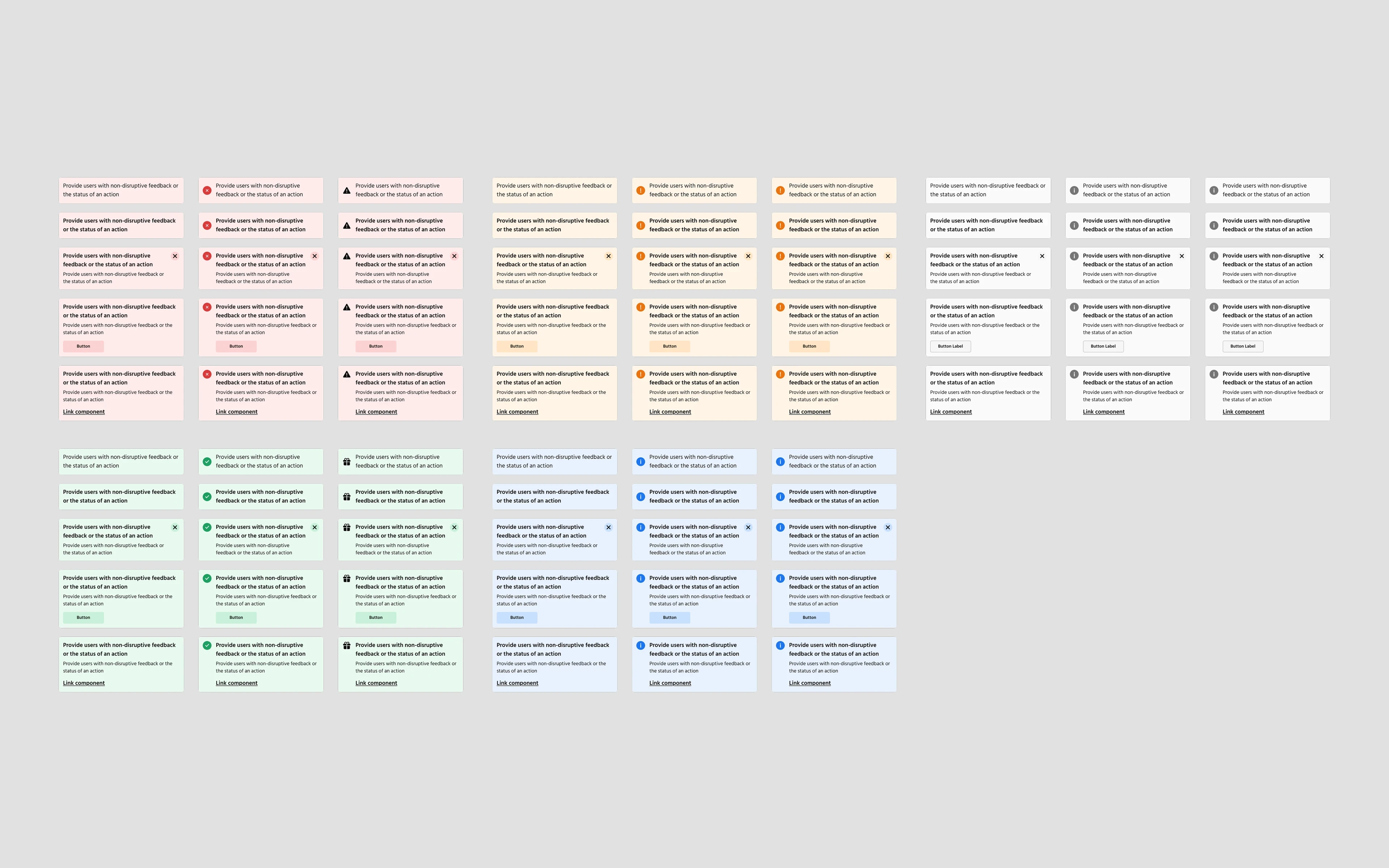
Message types had sprawled into a dozen treatments. So they reduced to five intents — neutral, informational, success, warning, error — each pairing a color with a default icon and a clear meaning. Color always travels with an icon and text, so intent never depends on color alone.
“Important” messages were shouted inconsistently. So a second axis was added: subtle (tinted, the default) and bold (solid fill) for messages that genuinely must not be missed — documented as subtle by default, bold sparingly, or it stops signaling urgency.
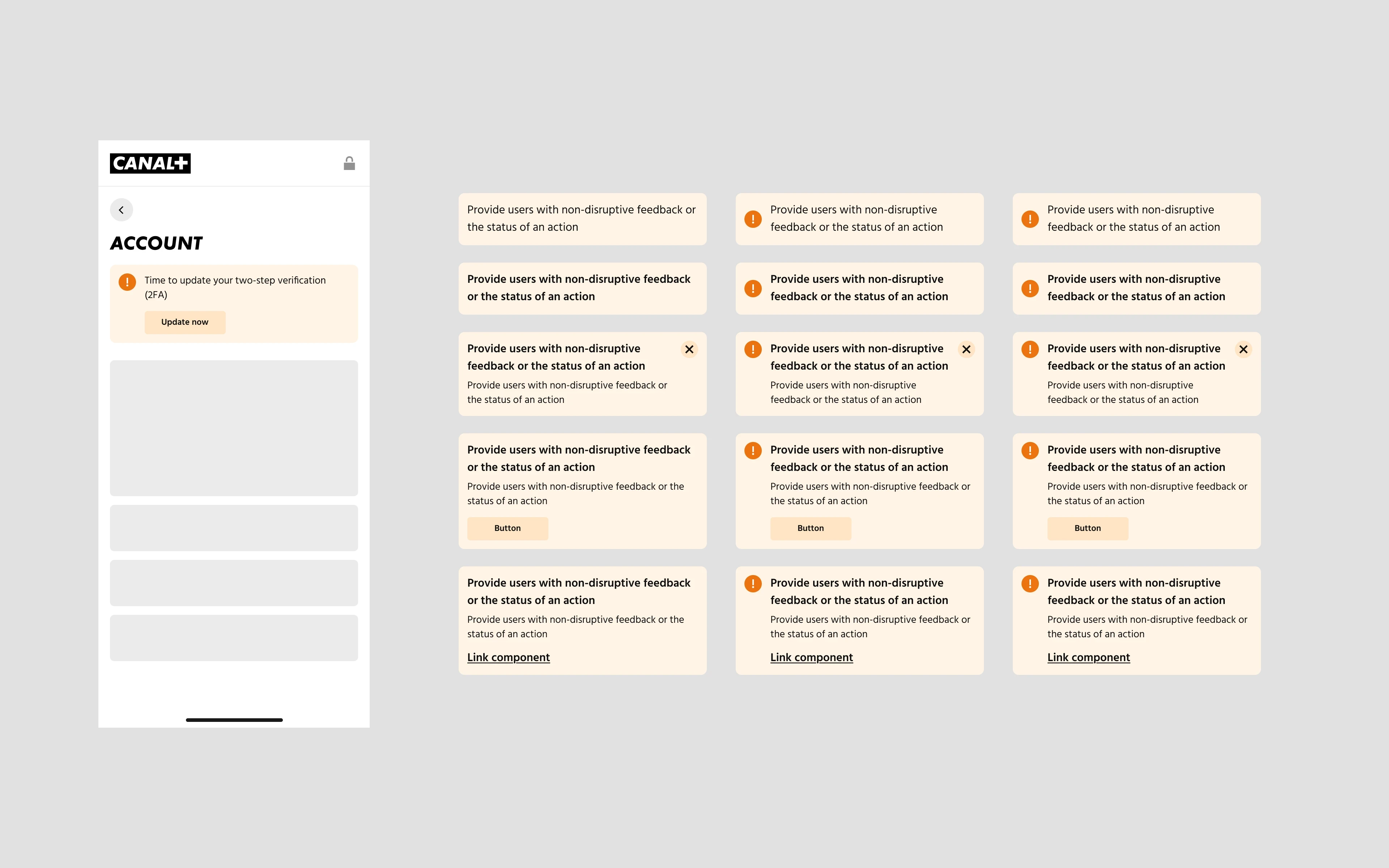
Near-identical messages were hand-built with mismatched parts. So one anatomy was defined — container, leading icon, title, optional description, optional action, optional dismiss — shipping the six content configurations the audit proved were actually needed, across light/dark themes and mobile/desktop layouts.
Accessibility kept arriving last. So it was designed in: color + icon + text redundancy, WCAG 2.1 AA contrast verified in both emphasis levels and themes,
role="alert"for blocking errors androle="status"for success/info, a focusable labeled dismiss, and decorative icons hidden from assistive tech.
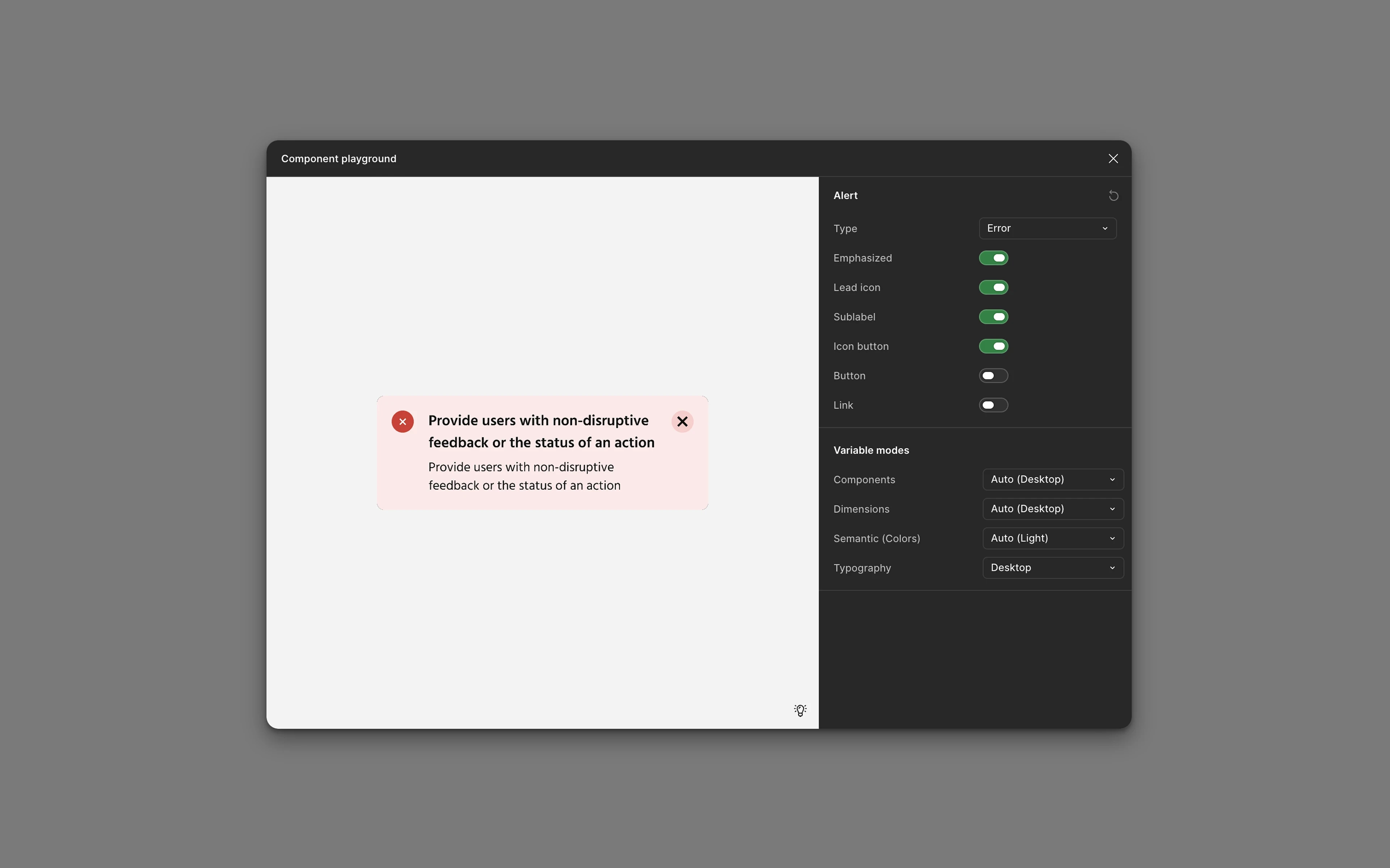
The component was then built in Figma with properties that mirror these decisions — intent, emphasis, icon, title/description, action, dismissible, theme, breakpoint — so any state is produced from one instance instead of rebuilt by hand. A documentation page carried the rest: when to use it versus its siblings, content guidelines, behavior and placement, accessibility, and do’s & don’ts that make the common mistakes hard to repeat.
Results
A design-system component doesn’t move a conversion chart — its impact shows up in how the team works. The clearest signal: messaging stopped being a design problem. A dozen hand-built variations collapsed into one component, and the recurring work of inventing a message from scratch turned into picking an intent and an emphasis.
That change rippled outward. Design reviews sped up, because the conversation was no longer “how should this look?” but “which intent?” The shared vocabulary — Alert, Banner, Toast, Dialog — quietly ended the naming arguments that used to open every messaging discussion. Accessibility came for free, baked into the component instead of caught in review. And engineers built from one spec rather than reverse-engineering screenshots.
What’s next. Pressure-test the five-intent / two-emphasis model against real usage data, decide whether Neutral and Informational should merge, and wire up Code Connect so the Figma component maps cleanly to its coded counterpart.
What could have gone better. The family map earned its place — but it should have come first; a few early debates were really boundary questions wearing a costume. And five intents remains a hypothesis until the data confirms it, so a lightweight way to measure intent usage should have shipped alongside the component.